- Dependencies: scipy, numpy, seaborn, matplotlib, pandas, json, statsmodels
This is a simple plotting package made to facilitate the easy creation of beautiful images. Similar examples can be found in seaborn, Matplotlib cookbooks, and pandas, but these were made with my specific data in mind. There are examples below; many more can be found in my publications. In general, they are simple enough for a basic Python user to manipulate. Feel free to message me with questions or suggestions.
The majority of these functions take a list of lists (LOL, or matrix) as the input. Most functions want an LOL and its associated labels, which could easily be taken from a dictionary or pandas DataFrame.
Here's an example input:
values = [ np.random.random(200)*4. + 50, np.random.random(200)*4.1 + 50, np.random.random(200)*5.6 + 50, np.random.random(100)*3.6 + 40, np.random.random(100)*4.1 + 55, np.random.random(100)*3.1 + 45, ] labels = [ 'Pyramidal', 'Pyramidal', 'Pyramidal', 'PV+ interneuron', 'PV+ interneuron', 'PV+ interneuron', ]
Passing this to, say, hori_scatter produces a 1x6 array of subplots.
This plotting suite was made for highly variable data, and so robust measures were needed in addition to intuitive plots. Medians are shown as often as means, and generally every sample has its own subplot. The data can be easily normalized and put on a log scale, and the groups are color coded based on set(labels), so the example above would have two colors. Colors can be easily changed.
Many of these plots display inter-quartile range, either as shading or with simple whiskers. The internal workings of many plots are similar, so if you can decipher one you'll have a good idea of what's going on in the others. See below for some examples.
Most plots have several of the following:
- title (str), axes (list of str, i.e.: ['','Length'] if no x-label is desired)
- bounds/rrange ([maxY, minY] or bool) - if outliers make data in a ragion-of-interest difficult to see, setting bonds will force outliers to sit on the boundary so the ROI can be examined
- showmean / showboth (bool) - show the mean +/- median, usually as a purple line (median: dashed/dotted)
- switch (bool) - move dataset[0] to the back
- llog (bool) - plot on a log scale
- counts (bool) - show the number of data points in a list above the subgraph (helpful for small, non-uniform values)
- xcnt (bool) - (for histograms and violins) show the max histogram value; since histograms/violins are normalized, one looses sight of the amount of data, and sometimes we're interested in when 1000 vs 40000 values contributes to the distribution
- bench (double/list) - plot a benchmark as a light purple line at the value; if a list, can be different for each plot
- forcebins (int/list) - for histograms/violins, can force a max number of bins (or specify exact bins). If the number of filled (len>=1) bins is less than forcebins/2, new bins are calculated and len(filled_bins)*2 is used for the number of bins
- showleg (bool, str) - if True, 'best' is used for the legend position, otherwise can be specified; False means legend is hidden
- shade (bool) - (deprecated) IQRs used to be shown as large transparent blocks; some of this code is still hanging around though it doens't do anything in most cases
- eps (bool) - (deprecated) PyPlot has difficulty saving alpha values to *.eps files, so a different hue of the color was used previously for shading; now, this color ("altcolor") is used for IQRs for all plots
There are many many different kinds of plots in pretty_plot and DF_plots; here are few examples and when you might use them.
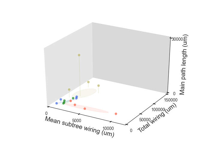
- pretty_3d 3-D feature plot with shadows
Three features (v1, v2, v3) and their associated labels (labelsin -- used for color and legend) as plotted in 3-D. shadows drops a line to the plane where shadows = 0 (i.e.: shadows='z' drops a line from the point to the XY-plane). ellipses shows the standard deviation in the XY-plane on the XY-plane; without much work, this could be changed from ellipses to 2-D crosshairs or whiskers.
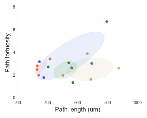
- pretty_2d 2-D feature plot
Similar to 3-D but ellipses now show all relevant information (no z-dimension to ignore).
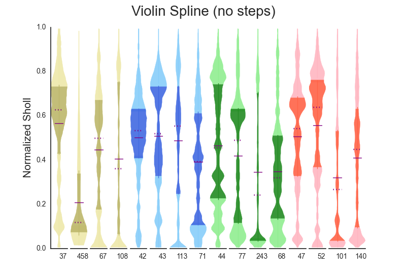
- violin_spline Modified boxplot
This is obviously based on the beautiful Seaborn package that everyone should be using (https://stanford.edu/~mwaskom/software/seaborn/). A main difference (as of this writing, 4/2016) is that the IQR is differentiated by another hue of the same color. stepfilled (bool) shows the underlying histogram used to generate the data.
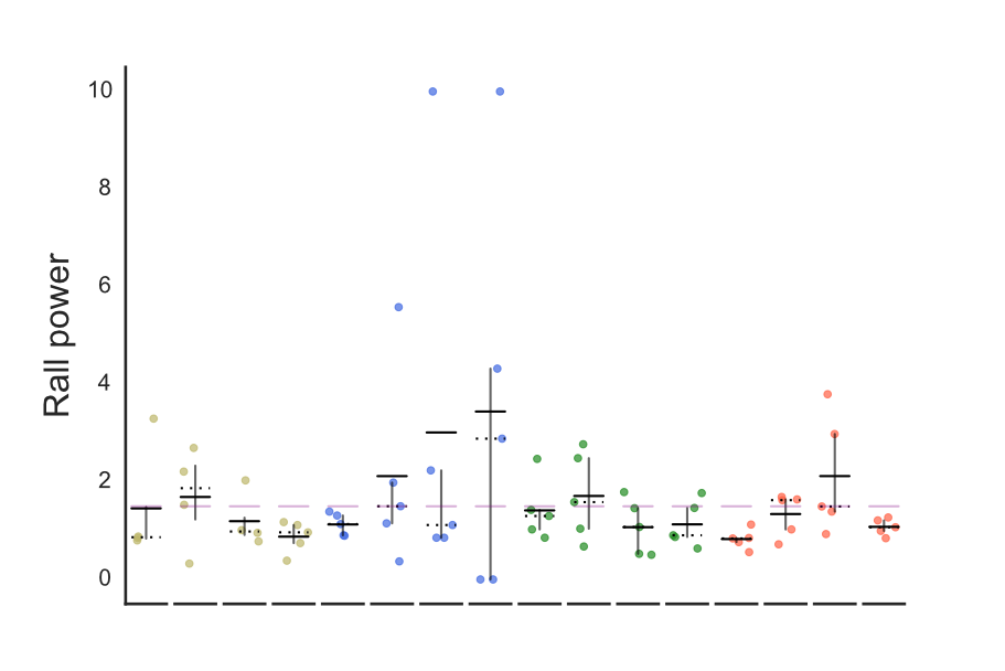
- hori_scatter Horizontal scatter plot
This allows for a bench to be set (see above), and can indicate the IQR with simple lines. Simple is good.
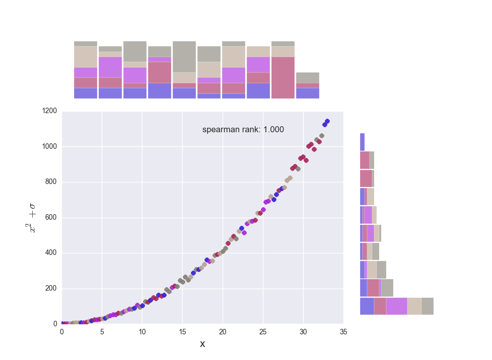
- hist_2d 2-D scatter with histograms for each dimension
Inspired by a pandas visualization page (https://www.kaggle.com/benhamner/d/uciml/iris/python-data-visualizations), this scatterplots data and shows histograms for each of the dimensions. The histograms can be stacked to show the composition of each bin (by group label) or the overall color can be 'tinted' based on the composition.
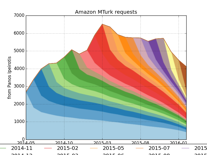
- cohort Cohort analysis
Cohort analysis (explained very well here: http://www.behind-the-enemy-lines.com/2016/02/a-cohort-analysis-of-mechanical-turk.html) is a great way to visualize churn -- how many users (or samples/preparations) hang around, and for how long, after joining.
Somewhat maintained by Alex Sutton.
