Mobile control #123
Comments
|
pinch to zoom? I like the idea of just having labelled buttons in the places where you've put the boxes, but with pause on the bottom right. I think by far the biggest problem is figuring out how to start jetzt and select content to read. At least in the context of a browser. Firefox mobile has extensions, which is great, but others don't so you're very limited by bookmarklets. |
|
Nice, added pinch to zoom. True, but I don't really know a solution, so I thought to fix the issues I could fix first. |
|
Why put pause bottom right? Because the label might overlap the reader? |
|
I believe those "boxes" are meant to represent "hot" areas of the screen, and would not actually be visible. I prefer the swipe idea. Feels a lot more natural. No need for a tutorial. Most well designed gestures come naturally to people who are familiar with touch screens. You could have a little "?" in one of the corners with a single screen help graphic. @peteruithoven have you looked at Apache Cordova? Would it be possible to package jetzt up as an actual app we distribute through the App Store? See #76 for more. |
|
I like both of your ideas and and now dislike my own so 👍 |
|
@nslater, nop, I don't really feel like paying apple 100,- per year to get into their store or to even get it on my phone. But I'm sure someone else does. I like the ? in a corner idea, this would be usefull to show the keys as well. |
Let's brainstorm on controlling Jetzt on mobile platforms like phones and tablets, where we are mostly limited to touch.
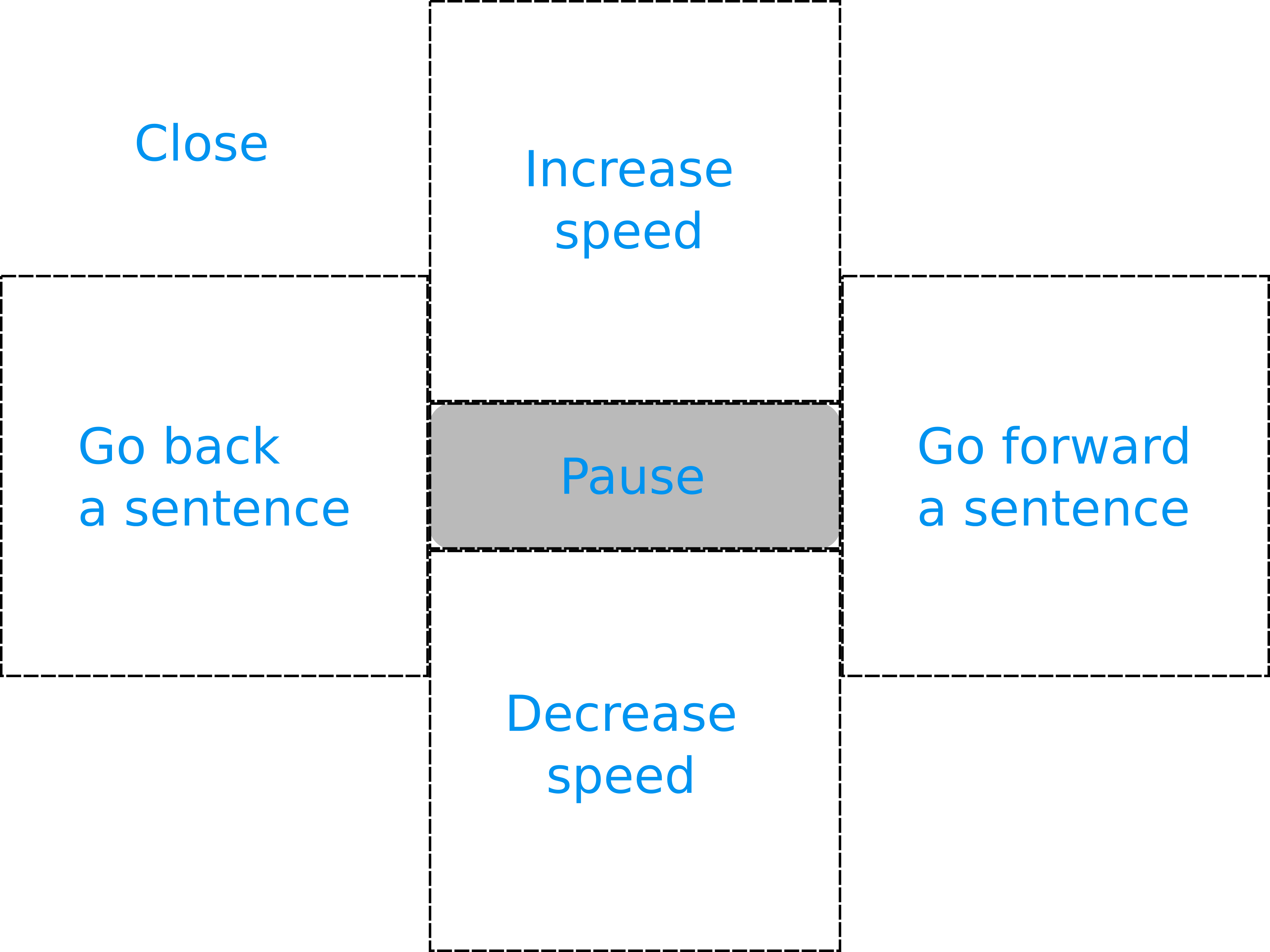
We could for example split up the screen in different areas where each area has a function. A first attempt:
Another option is using swipe gestures, using a library like Hammer.js.
A first attempt:
In combination with:
Ideas and opinions are welcome.
The text was updated successfully, but these errors were encountered: