-
Notifications
You must be signed in to change notification settings - Fork 6
New issue
Have a question about this project? Sign up for a free GitHub account to open an issue and contact its maintainers and the community.
By clicking “Sign up for GitHub”, you agree to our terms of service and privacy statement. We’ll occasionally send you account related emails.
Already on GitHub? Sign in to your account
Monochrome icons that don't follows plasma color scheme #73
Comments
|
Hi, sorry for not noticing them earlier. I found these on my other machine with different software. Two more of them: |
|
Again, always re-choose Evolvere and restart the app (including plasmashell), some of these icons already done. |
|
The outline color is set to the background color, not the background color of the selection, maybe that's why, sometimes, you're see dark parts. This will be "fixed" once all the monochrome icons have been migrated, then, with the script, the outlines can be fully transparent, keeping visible only the text color. |
|
I thought of a better way to find all monochrome icons that don't use the colour-scheme colours, without having to spot them at sight. Just launch this grep in the main icons folder. It searches for all files that doesn't contain the string "ColorScheme" or "currentColor" (case insensitive). There will be duplicates, because it lists all symlinks too.
I don't know if you already have a list of all them, but I thought it could be handy and surely less annoying than me adding a comment every time I found some 😉 |
|
This is very useful, thank you!. Right now I'm optimizing all small icons by hand (if you know any way to do this in batch, would be extremely useful), then apply, via script, the monochrome support. |
|
If it's a simple string substitution or something that can be done from the CLI, I could try to make a script. edit: I just found that, but never tried it: https://github.com/svg/svgo |
|
Perfect! Thank you! |


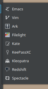
I know that you are redrawing all monochrome icons to reflect the color scheme in plasma. By changing my theme to a darker one, I found some of them in the old style, that were harder to spot with a light theme.

Ark, Redshift
Gwenview, Libreoffice Draw, Okular
Konversation, Qbittorrent(?)
Cool retro term, kinfocenter, ksystemlog, kwalletmanager, k3b
All libreoffice applications
All session icons
Also, some sizes of the telegram icon

The text was updated successfully, but these errors were encountered: