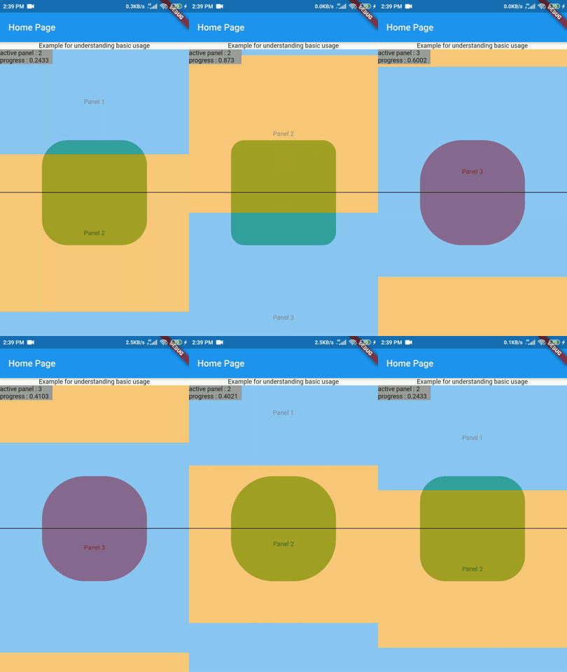
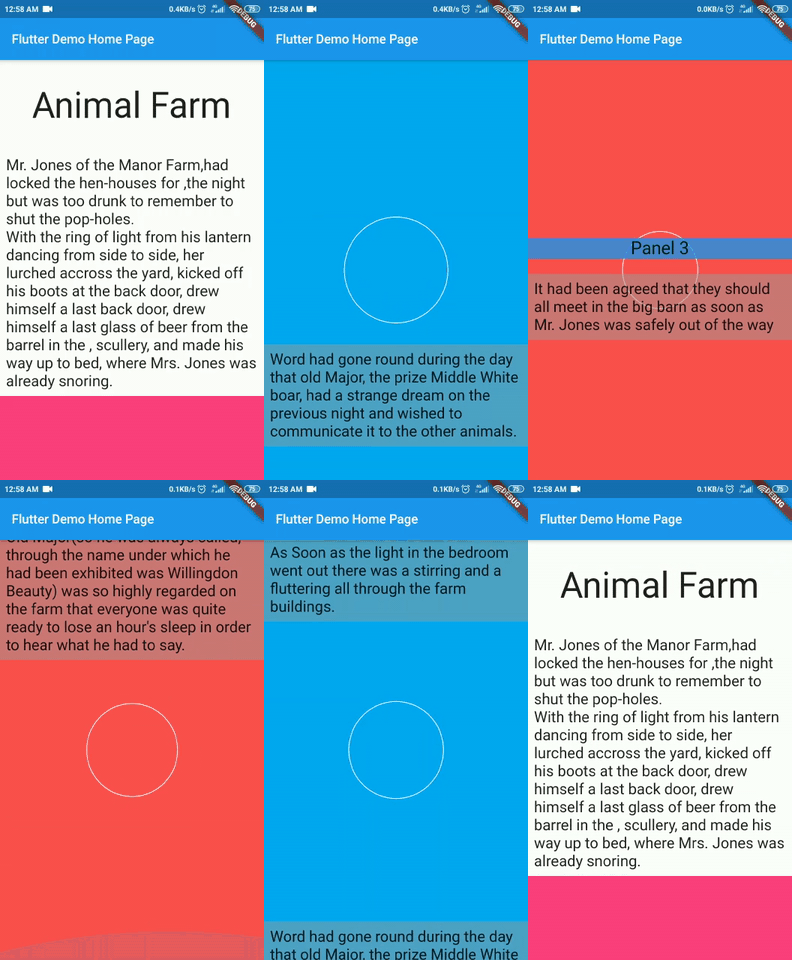
A flutter package to implement ScrollyTelling in your flutter app. Using ScrollyTell you can have the background changing dynamically as you scroll. ScrollyTell provides a mechanism to fully control this behaviour. Visit our medium blog.
dependencies:
scrollytell: ^1.0.4import 'package:scrollytell/scrollytell.dart';| props | type | default value | Description |
|---|---|---|---|
| panels (required) | List Widget | A list of panel widgets | |
| panelStartCallback | Function(num, Function) | Called on start of new panel | |
| panelEndCallback | Function(num, Function) | Called on end of existing panel | |
| panelProgressCallback | Function(num, double, Function) | Called every frame | |
| opacity | double | 1 | Set opacity of the panels |
| lastPanelForceComplete | bool | false | Set true if the last panel hits bottom of the screen and can't be scrolled through |
| initialOverlayWidget | Widget | none | Overlay widget before start of scrolling |
| guidelinePosition | GuidelinePosition | GuidelinePosition.top | Set position of guideline |
| stickyChartIndex | int | null | The panel of corresponding index will dock at center when scrolled past the center |
| showDebugConsole | bool | false | show debug console (activePanelIndex, progress) and debug line (guideline) |
At least one of the panelStartCallback, panelProgressCallback, panelEndCallback must be non-null.
Panel is a widget. The list of panels form a scrolling sequence. In simple words, each panel is widget that remains in foreground while scrolling.
The overlay widget is what you want to be dynamically changed as you scroll. For example: In a simple story telling app, the panel will consist of a text portion of the story, while the OverlayWidget shows a corresponding graphic.
Guideline is an imaginary reference line. When the panel's top coincide with the guideline we say panel has been 'started' or the panel is 'active' and panelStartCallback is called. Similarily when panel's bottom touch guideline we say panel is ended andpanelEndCallback is called.
You can choose the guidelinePosition to be either at ScrollyWidget's top, center, bottom.
An integer value corresponding to the panel that is "active"(coincides with the guideline).
A double value that depicts how much the panel has been scrolled past the guideline. For example: When the center of panel reaches guideline progress is half.
List<Widget> panelList = [Text('Hello Scrollytell'), Text('Hello Flutter')];Widget overlayWidget;Widget _scrollyWidget = ScrollyWidget(
showDebugConsole: true,
guidelinePosition: GuidelinePosition.center,
panels: panelList,
panelStartCallback: (activePanelNumber, func){},
panelEndCallback: (endingPanelNumber, func){},
panelProgressCallback: (activePanelNumber, progress, func){
// set properties of overlay widget using activePanelNumber and progress
double rad = (progress <= 0.5) ? progress * 200 : 200 - progress * 200;
overlayWidget = Center(
child: Container(
width: 200,
height: 200,
decoration: BoxDecoration(
borderRadius: BorderRadius.all(
Radius.circular(rad),
),
color: Colors.red,
),
),
);
// then pass it into the function
func(overlayWidget)
},
)Option 1 : Wrap in Expanded for covering the remaining screen.
Expanded(child: _scrollyWidget)Option 2 : Wrap in Flexible
Flexible(child: _scrollyWidget)Option 3 : Wrap in container to give it desired size.
Container(height: 500, width: 300, child: _scrollyWidget)Scaffold(body: _scrollyWidget)For more info, refer to the basic_usage app in the example.
- The overlayWidget will continue to be the one which was last set in the callback(s) unless you explicitly change it.
- When you do not want to display anything at overlayWidget set it to be
Container()
- Sometimes you may want to include want to include containers at start (maybe a heading) and want it
to scroll with your actual panels. The best option is to add it as a panel in the
panelListand not manipulate the overlayWidget when activePanelIndex is 1. - A similar approach can be applied when you want include containers (like large empty spaces) in between you actual panels (like, text portions of story). Just include the container at the appropriate position in the panelList and not manipulate the overlayWidget when activePanelIndex is corresponding index.

|

|

|
If you encounter any problems feel free to open an issue. If you feel the library is missing a feature, please raise a issue(label:enhancement) on Github and we will look into it. Pull requests are most welcome.
If you want to contribute to improve this library, please read our guidelines. Feel free to open an issue.
MIT License view license
This project draws inspiration from @google's Scrollytell.


