To simplify block customization and ensure a consistent experience for users, there are a number of built-in UI patterns to help generate the editor preview. Like with the RichText component covered in the previous chapter, the wp.editor global includes a few other common components to render editing interfaces. In this chapter, we'll explore toolbars and the block inspector.
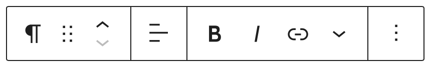
When the user selects a block, a number of control buttons may be shown in a toolbar above the selected block. Some of these block-level controls are included automatically if the editor is able to transform the block to another type, or if the focused element is a RichText component.
You can also customize the toolbar to include controls specific to your block type. If the return value of your block type's edit function includes a BlockControls element, those controls will be shown in the selected block's toolbar.
{% codetabs %} {% ESNext %}
import { registerBlockType } from '@wordpress/blocks';

import {
	useBlockProps,
	RichText,
	AlignmentToolbar,
	BlockControls,
} from '@wordpress/block-editor';

registerBlockType( 'gutenberg-examples/example-04-controls-esnext', {
	apiVersion: 2,
	title: 'Example: Controls (esnext)',
	icon: 'universal-access-alt',
	category: 'design',
	attributes: {
		content: {
			type: 'array',
			source: 'children',
			selector: 'p',
		},
		alignment: {
			type: 'string',
			default: 'none',
		},
	},
	example: {
		attributes: {
			content: 'Hello World',
			alignment: 'right',
		},
	},
	edit: ( { attributes, setAttributes } ) => {
		const onChangeContent = ( newContent ) => {
			setAttributes( { content: newContent } );
		};

		const onChangeAlignment = ( newAlignment ) => {
			setAttributes( {
				alignment: newAlignment === undefined ? 'none' : newAlignment,
			} );
		};

		return (
			<div { ...useBlockProps() }>
				{
					<BlockControls>
						<AlignmentToolbar
							value={ attributes.alignment }
							onChange={ onChangeAlignment }
						/>
					</BlockControls>
				}
				<RichText
					className={ attributes.className }
					style={ { textAlign: attributes.alignment } }
					tagName="p"
					onChange={ onChangeContent }
					value={ attributes.content }
				/>
			</div>
		);
	},
	save: ( props ) => {
		const blockProps = useBlockProps.save();

		return (
			<div { ...blockProps }>
				<RichText.Content
					className={ `gutenberg-examples-align-${ props.attributes.alignment }` }
					tagName="p"
					value={ props.attributes.content }
				/>
			</div>
		);
	},
} );
{% ES5 %}
( function ( blocks, blockEditor, element ) {
	var el = element.createElement;
	var RichText = blockEditor.RichText;
	var AlignmentToolbar = blockEditor.AlignmentToolbar;
	var BlockControls = blockEditor.BlockControls;
	var useBlockProps = blockEditor.useBlockProps;

	blocks.registerBlockType( 'gutenberg-examples/example-04-controls', {
		title: 'Example: Controls',
		icon: 'universal-access-alt',
		category: 'design',

		attributes: {
			content: {
				type: 'array',
				source: 'children',
				selector: 'p',
			},
			alignment: {
				type: 'string',
				default: 'none',
			},
		},
		example: {
			attributes: {
				content: 'Hello World',
				alignment: 'right',
			},
		},
		edit: function ( props ) {
			var content = props.attributes.content;
			var alignment = props.attributes.alignment;

			function onChangeContent( newContent ) {
				props.setAttributes( { content: newContent } );
			}

			function onChangeAlignment( newAlignment ) {
				props.setAttributes( {
					alignment:
						newAlignment === undefined ? 'none' : newAlignment,
				} );
			}

			return el(
				'div',
				useBlockProps(),
				el(
					BlockControls,
					{ key: 'controls' },
					el( AlignmentToolbar, {
						value: alignment,
						onChange: onChangeAlignment,
					} )
				),
				el( RichText, {
					key: 'richtext',
					tagName: 'p',
					style: { textAlign: alignment },
					onChange: onChangeContent,
					value: content,
				} )
			);
		},

		save: function ( props ) {
			var blockProps = useBlockProps.save();

			return el(
				'div',
				blockProps,
				el( RichText.Content, {
					tagName: 'p',
					className:
						'gutenberg-examples-align-' +
						props.attributes.alignment,
					value: props.attributes.content,
				} )
			);
		},
	} );
} )( window.wp.blocks, window.wp.blockEditor, window.wp.element );
{% end %}
Note that BlockControls is only visible when the block is currently selected and in visual editing mode. BlockControls are not shown when editing a block in HTML editing mode.
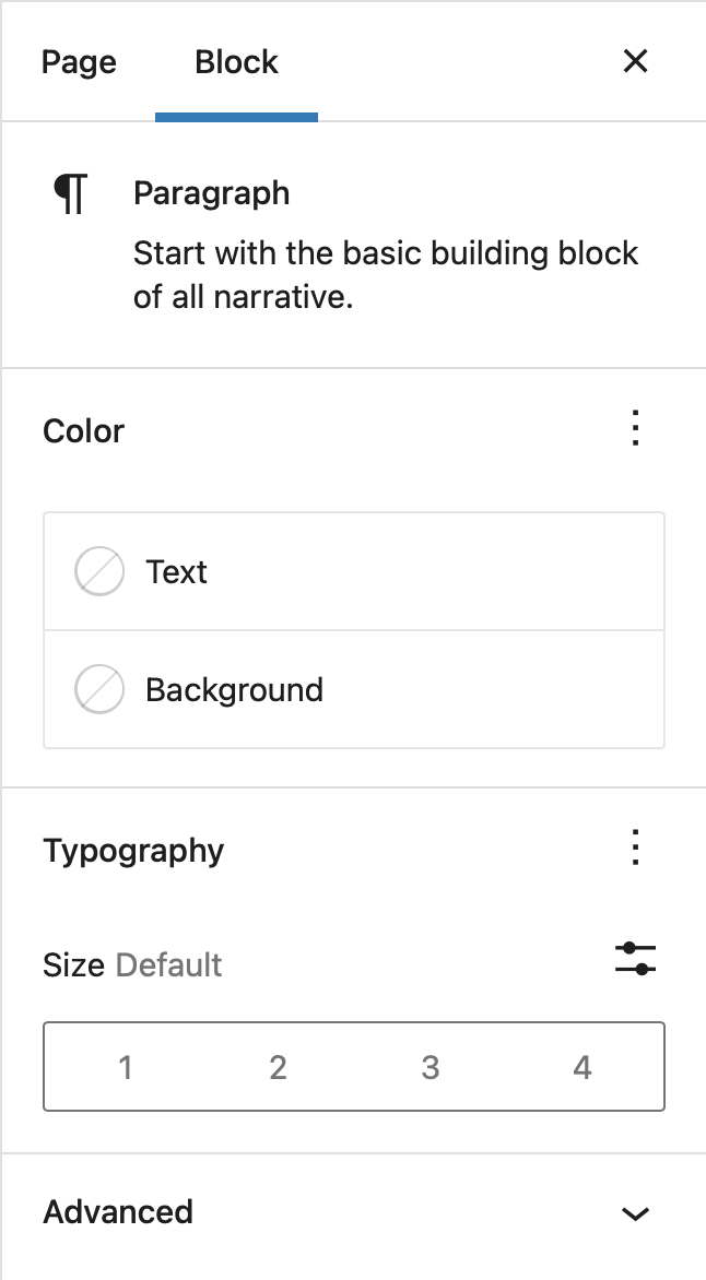
The Settings Sidebar is used to display less-often-used settings or settings that require more screen space. The Settings Sidebar should be used for block-level settings only.
If you have settings that affects only selected content inside a block (example: the "bold" setting for selected text inside a paragraph): do not place it inside the Settings Sidebar. The Settings Sidebar is displayed even when editing a block in HTML mode, so it should only contain block-level settings.
The Block Tab is shown in place of the Document Tab when a block is selected.
Similar to rendering a toolbar, if you include an InspectorControls element in the return value of your block type's edit function, those controls will be shown in the Settings Sidebar region.
The following example adds 2 color palettes to the sidebar, one for the text color and one for the background color.
import { registerBlockType } from '@wordpress/blocks';
import { __ } from '@wordpress/i18n';
import { TextControl } from '@wordpress/components';

import {
	useBlockProps,
	ColorPalette,
	InspectorControls,
} from '@wordpress/block-editor';

registerBlockType( 'create-block/gutenpride', {
	apiVersion: 2,
	attributes: {
		message: {
			type: 'string',
			source: 'text',
			selector: 'div',
			default: '', // empty default
		},
		bg_color: { type: 'string', default: '#000000' },
		text_color: { type: 'string', default: '#ffffff' },
	},
	edit: ( { attributes, setAttributes } ) => {
		const onChangeBGColor = ( hexColor ) => {
			setAttributes( { bg_color: hexColor } );
		};

		const onChangeTextColor = ( hexColor ) => {
			setAttributes( { text_color: hexColor } );
		};

		return (
			<div { ...useBlockProps() }>
				<InspectorControls key="setting">
					<div id="gutenpride-controls">
						<fieldset>
							<legend className="blocks-base-control__label">
								{ __( 'Background color', 'gutenpride' ) }
							</legend>
							<ColorPalette // Element Tag for Gutenberg standard colour selector
								onChange={ onChangeBGColor } // onChange event callback
							/>
						</fieldset>
						<fieldset>
							<legend className="blocks-base-control__label">
								{ __( 'Text color', 'gutenpride' ) }
							</legend>
							<ColorPalette // Element Tag for Gutenberg standard colour selector
								onChange={ onChangeTextColor } // onChange event callback
							/>
						</fieldset>
					</div>
				</InspectorControls>
				<TextControl
					value={ attributes.message }
					onChange={ ( val ) => setAttributes( { message: val } ) }
					style={ {
						backgroundColor: attributes.bg_color,
						color: attributes.text_color,
					} }
				/>
			</div>
		);
	},
	save: ( { attributes } ) => {
		return (
			<div
				{ ...useBlockProps.save() }
				style={ {
					backgroundColor: attributes.bg_color,
					color: attributes.text_color,
				} }
			>
				{ attributes.message }
			</div>
		);
	},
} );
Block controls rendered in both the toolbar and sidebar will also be used when multiple blocks of the same type are selected.