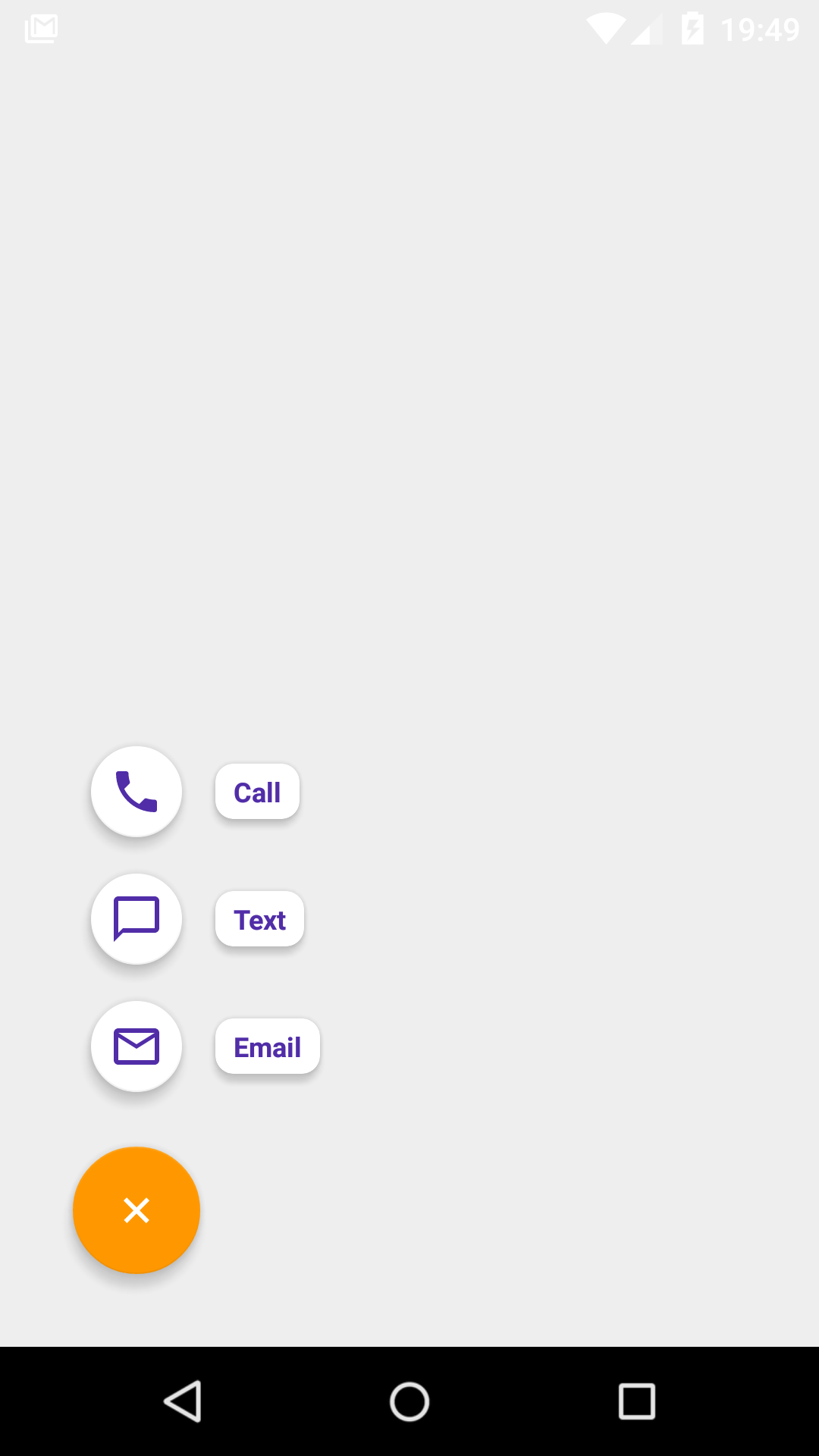
A simple library marrying together [FAB] (http://developer.android.com/reference/android/support/design/widget/FloatingActionButton.html) + [menu resources] (http://developer.android.com/guide/topics/resources/menu-resource.html) + [Speed dial metaphor from Material Design] (https://www.google.com/design/spec/components/buttons-floating-action-button.html#buttons-floating-action-button-transitions).
Similarly tо [NavigationView] (http://developer.android.com/reference/android/support/design/widget/NavigationView.html?utm_campaign=io15&utm_source=dac&utm_medium=blog) and [ActionBar] (http://developer.android.com/reference/android/app/ActionBar.html), [FabSpeedDial] (https://github.com/yavski/fab-speed-dial/blob/master/library/src/main/java/io/github/yavski/fabspeeddial/FabSpeedDial.java) makes use of [menu resources] (http://developer.android.com/guide/topics/resources/menu-resource.html) in order to present a list of actionable buttons. This makes the library somewhat familiar to use and easy to integrate. The library runs on Android 2.2 (API 8) onwards.
dependencies {
    compile 'io.github.yavski:fab-speed-dial:1.0.6'
}
<menu xmlns:android="http://schemas.android.com/apk/res/android"
    xmlns:app="http://schemas.android.com/apk/res-auto">
    <item
        android:id="@+id/action_call"
        android:icon="@drawable/ic_call_black_24px"
        android:title="@string/menu_item_call" />
    <item
        android:id="@+id/action_text"
        android:icon="@drawable/ic_chat_bubble_outline_black_24px"
        android:title="@string/menu_item_text"/>
    <item
        android:id="@+id/action_email"
        android:icon="@drawable/ic_mail_outline_black_24px"
        android:title="@string/menu_item_email" />
</menu>
<FrameLayout xmlns:android="http://schemas.android.com/apk/res/android"
    xmlns:app="http://schemas.android.com/apk/res-auto"
    android:layout_width="match_parent"
    android:layout_height="match_parent"
    android:padding="16dp">

    <io.github.yavski.fabspeeddial.FabSpeedDial
        android:layout_width="wrap_content"
        android:layout_height="wrap_content"
        android:layout_gravity="bottom|end"
        app:fabGravity="bottom_end"
        app:fabMenu="@menu/menu_main"
        app:miniFabBackgroundTint="@android:color/white"
        app:miniFabDrawableTint="?attr/colorPrimaryDark"
        app:miniFabTitleTextColor="?attr/colorPrimaryDark" />

</FrameLayout>
In order to save the menu open/closed state, you must define an id to the FabSpeedDial, otherwise if you rotate the device the state won't be persisted.
As with all menus, you have a callback just before the list of actionable items are presented. The callback allows you to update your menu items, or not show the menu altogether.
        FabSpeedDial fabSpeedDial = (FabSpeedDial) findViewById(R.id.fab_speed_dial);
        fabSpeedDial.setMenuListener(new SimpleMenuListenerAdapter() {
            @Override
            public boolean onPrepareMenu(NavigationMenu navigationMenu) {
                // TODO: Do something with yout menu items, or return false if you don't want to show them
                return true;
            }
        });
Similarly, in order to be notified about a selection:
        FabSpeedDial fabSpeedDial = (FabSpeedDial) findViewById(R.id.fab_speed_dial);
        fabSpeedDial.setMenuListener(new SimpleMenuListenerAdapter() {
            @Override
            public boolean onMenuItemSelected(MenuItem menuItem) {
               //TODO: Start some activity
              return false;
            }
        });
Define an integer-array resource that contains the colors you want to use in the order of the items you want colored:
<integer-array name="fab_menu_item_colors">
    <!-- A dark Holo shade of red -->
    <item>@android:color/holo_red_dark</item>
    <!-- A Holo shade of purple -->
    <item>@android:color/holo_purple</item>
    <!-- A light Holo shade of green -->
    <item>@android:color/holo_green_light</item>
</integer-array>
Make sure you also assign android:orderInCategory to each menu item in your menu.xml in the same 0-based order.
To provide the color array to the menu items use the following attributes: miniFabTitleTextColorList and miniFabBackgroundTintList. Note - if you've used miniFabTitleTextColor and miniFabBackgroundTint they will be overriden by the color arrays.
In order to change the position of the view, use the standard android APIs to position FabSpeedDial within your ViewGroup and be sure to assign fabGravity a relevant value.
As a rule of thumb, attributes prepended with fab, i.e. fabDrawable, refer to the normsal-sized FAB view; attribtues prepended with miniFab refer to the mini-sized FAB views in the list.
The following attribtues are supported:
| FabSpeedDial | Android | Desscription |
|---|---|---|
| app:fabDrawable | android:src | Sets the icon drawable of the main FAB |
| app:fabDrawableTint | android:tint | Tints the icon drawable of the main FAB |
| app:fabBackgroundTint | android:backgroundTint | Tints the background colour of the main FAB |
| app:miniFabDrawableTint | android:tint | Tints the icon drawable of the mini FAB(s) |
| app:miniFabBackgroundTint | android:backgroundTint | Tints the background colour of the mini FAB(s) |
| app:miniFabBackgroundTintList | An array containing the background colors for each of the mini FABs. | |
| app:miniFabTitleTextColor | [android:textColor] (https://developer.android.com/reference/android/widget/TextView.html#attr_android:textColor) | Sets the color of the title of the mini FAB. |
| app:miniFabTitleTextColorList | An array containing the colors for each of the titles of the mini FABs. | |
| app:miniFabTitleBackgroundTint | android:backgroundTint | Tints the background colour of the title(s) of the mini FAB(s) |
| app:miniFabTitlesEnabled | Convinience for hiding the tilte(s) of the mini FAB(s) | |
| app:touchGuard | Hide FAB when touching out of its bounds | |
| app:touchGuardDrawable | android:background | Sets background to the container of FAB |
If you have used FloatingActionButton, CoordinatorLayout, and both combined, you are most probably aware that:
- Internally, FAB has two main implementations: one for SDK >= 21, one for earlier versions; the one for older versions uses extra padding in order to draw shadows; you don't need to account for the extra padding as the library takes care of it however do check your layouts/dimensions to avoid mis-positioned views.
- When used in a CoordinatorLayout, FAB is known to have its margin values ignored / misused under certain circumstances; as a workaround the library always adds left or right margin values (depending on gravity), taking into account the SDK version too.
<!--
  ~ Copyright 2016 Yavor Ivanov
  ~
  ~ Licensed under the Apache License, Version 2.0 (the "License");
  ~ you may not use this file except in compliance with the License.
  ~ You may obtain a copy of the License at
  ~
  ~     http://www.apache.org/licenses/LICENSE-2.0
  ~
  ~ Unless required by applicable law or agreed to in writing, software
  ~ distributed under the License is distributed on an "AS IS" BASIS,
  ~ WITHOUT WARRANTIES OR CONDITIONS OF ANY KIND, either express or implied.
  ~ See the License for the specific language governing permissions and
  ~ limitations under the License.
  -->


