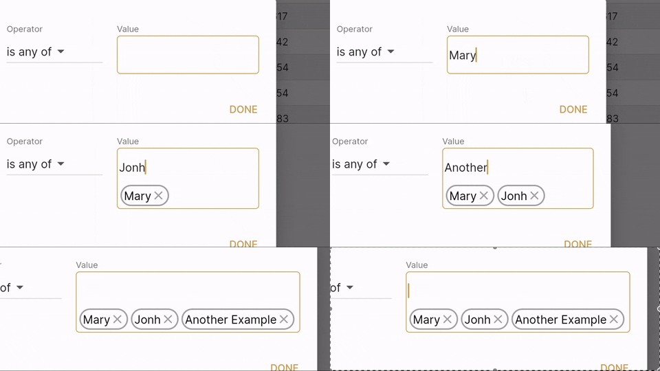
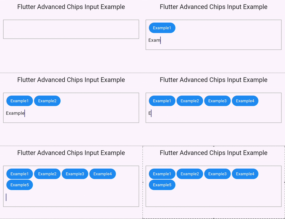
A Flutter package that provides a customizable text input widget for creating chips from the text. It supports chip deletion, input validation, and a variety of customization options such as container decoration, chip text style, and delete icon. Whether you want to create a list of tags, mentions, or any other list of items, this package helps you create a beautiful and functional chip input field.
- Create chips from text input.
- Delete chips with a customizable delete icon.
- Validate input before creating a chip.
- Customize chip container decoration, text style, and margins.
- Support for handling backspace key for deleting chips.
Import the package:
import 'package:flutter_advanced_chips_input/flutter_advanced_chips_input.dart';Then, simply include the AdvancedChipsInput widget in your widget tree:
AdvancedChipsInput(
  separatorCharacter: ' ',
  placeChipsSectionAbove: true,
  widgetContainerDecoration: BoxDecoration(
    border: Border.all(color: Colors.grey),
  ),
  chipContainerDecoration: BoxDecoration(
    color: Colors.blue,
    borderRadius: BorderRadius.all(Radius.circular(50)),
  ),
  chipTextStyle: TextStyle(color: Colors.white),
  validateInput: true,
  validateInputMethod: (value) {
    if (value.length < 3) {
      return 'Input should be at least 3 characters long';
    }
    return null;
  },
  onChipDeleted: (chipText, index) {
    print('Deleted chip: $chipText at index $index');
  },
),AdvancedChipsInput supports a variety of customization options:
separatorCharacter: Character used to separate the output. For example, ' ' will separate the output by space.placeChipsSectionAbove: Whether to place the chips section above or below the text field.widgetContainerDecoration: Decoration for the main widget container.marginBetweenChips: Margin between the chips.paddingInsideChipContainer: Padding inside the chip container.paddingInsideWidgetContainer: Padding inside the main widget container.chipContainerDecoration: Decoration for the chip container.chipTextStyle: Text style for the chip.deleteIcon: Icon for the delete method.validateInput: Whether to validate input before adding to a chip.validateInputMethod: Validation method.eraseKeyLabel: The key label used for erasing a chip. Defaults to 'Backspace'.autoFocus: Whether to autofocus the widget.textFormFieldStyle: Style for the text field.onChanged: Callback when the text field content changes.onEditingComplete: Callback when editing is complete.onSubmitted: Callback when the text field is submitted.onSaved: Callback when the text field is saved.onChipDeleted: Callback when a chip is deleted. Returns the deleted chip content and index.
Here is a complete example of a simple Flutter app that uses flutter_advanced_chips_input:
import 'package:flutter/material.dart';
import 'package:advanced_chips_input/advanced_chips_input.dart';

void main() => runApp(MyApp());

class MyApp extends StatelessWidget {
  @override
  Widget build(BuildContext context) {
    return MaterialApp(
      home: Scaffold(
        appBar: AppBar(
          title: Text('Flutter Advanced Chips Input Example'),
        ),
        body: Padding(
          padding: const EdgeInsets.all(16.0),
          child: AdvancedChipsInput(
            separatorCharacter: ' ',
            placeChipsSectionAbove: true,
            widgetContainerDecoration: BoxDecoration(
              border: Border.all(color: Colors.grey),
            ),
            chipContainerDecoration: BoxDecoration(
              color: Colors.blue,
              borderRadius: BorderRadius.all(Radius.circular(50)),
            ),
            chipTextStyle: TextStyle(color: Colors.white),
            validateInput: true,
            validateInputMethod: (value) {
              if (value.length < 3) {
                return 'Input should be at least 3 characters long';
              }
              return null;
            },
            onChipDeleted: (chipText, index) {
              print('Deleted chip: $chipText at index $index');
            },
          ),
        ),
      ),
    );
  }
}This project is licensed under the MIT License - see the LICENSE file for details.

