-
Notifications
You must be signed in to change notification settings - Fork 47
Plotting with PDL::Graphics::Gnuplot
PDL::Graphics::Gnuplot is a plotting package for PDL. It is not currently included in the main PDL distribution - you can get it from CPAN, or from Github. It is a Perl-only layer that works with the standalone gnuplot plotting program. You can get gnuplot from the SourceForge site; it is also available pre-compiled for most common platforms (including Gnu/Linux, MacOS, and Microsoft Windows) via the usual package distribution channels for each platform.
Gnuplot can plot 2-D and 3-D lines, curves, surfaces, and scientific images in B/W, pseudocolor, or full RGBA color. It can render plots on many devices, including interactive screen display and publication-quality output formats such as PDF.
You can get full documentation for gnuplot itself at the gnuplot.info site, or for the module in its POD, which is quite extensive.
Here we include some cookbooks and recipes for simple plots.
You load PDL::Graphics::Gnuplot in the usual way. Two symbols are exported by default: gplot and gpwin. The former is a catch-all entry point for plotting stuff with usual subroutine-calling syntax. The latter is a constructor for the object oriented interface.
The main entry point for plotting is the PDL::Graphics::Gnuplot::plot method, which is also exported by default as gplot. It accepts three kinds of arguments:
These are named options that affect the appearance or behavior of the plot as a whole. They include things like 2D/3D selection, location of the legend (called the "key" by gnuplot ), axis positioning and labeling, plot title, etc. You can set persistent plot options in the object itself with the options method, or just set transient ones on-the-fly in a call to plot. Plot options are supplied in a leading or trailing hash ref (or both) in the arg list.
These are named options that affect an individual curve only, such as the curve style (set by the with option). Curve options can be run inline in the argument list, or can be supplied as a hash ref.
Data for each plot are passed in as a collection of PDLs or array refs, called a "tuple". Each element of a "tuple" is called a "column", and represents some parameter of the data to be plotted -- e.g. ordinate, abscissa, color, glyph size, or error bar extent. Most types of plot use 1-D data; higher dimensions are threaded over, so you can pass in a 2-D column to generate many lines on a plot. Some types of plot use 2-D columns - for example, a grid mesh to be plotted in 3-D, or an image.
The argument list to plot thus contains:
- an optional hash ref containing plot options;
- Zero or more "curve blocks", each of which contains zero or more curve options followed by a tuple of data;
- another optional hash ref containing plot options.
Because the size of a tuple is not known in advance (and different tuple sizes can change the style of plot), you must place either a curve option or an empty hash in between separate tuples. Curve options are cumulative, so you don't have to re-enter them for each curve block if they don't change. The empty hash between tuples serves to delimit curve blocks that have the same curve options.
    use PDL::Graphics::Gnuplot;
    gplot( xvals(5)**2 );
That should produce a simple plot on your default output device. On most systems, it will appear on your screen and look more-or-less like this:

Different systems will render the plot slightly differently because they use different output devices ("terminals") by default. On Linux it is X11; on MaxOS it is a program called AquaTerm. You can change the default output device with an environment variable.
It is recommended that you use the object-oriented interface. The exported constructor gpwin builds PDL::Graphics::Gnuplot objects, that represent a connection to a particular underlying gnuplot process. The objects store persistent options and other state, and you can use them to send the same plot to multiple devices (for example, to tweak a plot interactively so you like it, and then render it in a publication-quality form). The constructor takes, as its first argument, the name of the output device (what gnuplot calles a "terminal") you want to use. The rest of the arguments are a collection of terminal options that modify the behavior of the terminal. Different terminals take different options. The enhanced option is a flag (on terminals that support it) indicating that you expect to use LaTeX-like markup for font and formatting information in text strings. Other common options include output (names an output file where appropriate), size (specifies an output size for the plot, in one of many convenient units), and font (names a system font and size to use by default for text markup on the plot).
    use PDL::Graphics::Gnuplot;
    $w = gpwin( wxt, enhanced=>1 ); # wxt is an anti-aliased X11 interactive terminal
Once you've defined an object, you can plot with it.
    $x = xvals(51)/50;
    $w = gpwin( png, output=>"PGG-points.png",size=>[320,240,'px'],font=>'Arial,9',enhanced=>1);
    $w->plot( {key=>'top center'}, legend=>"x^2", with=>"points", $x, $x**2 );
should yield the following:

There are several interactive output terminals. The wxt device is available on Gnu/Linux, MacOS, and Microsoft Windows, and allows you to pan and zoom the plot, and also to read off coordinates by placing the cursor over them. The wxt and x11 terminals also let you read mouse input into your script.
You can read mouse input like this:
    $r = sin(rvals(51,51)/5) + sin(xvals(51,51)/10); # Generate some data
    $w = gpwin(wxt);
    $w->image($r);
    ($x,$y,$status) = $w->read_mouse();
The read_mouse() call will die unless $w is an interactive device that can accept mouse input. On return, $x and $y are the scientific coordinates of the click (in polar coordinates, they are actually r and theta); and $status is a hash containing mouse status. The "b" key points to the mouse button that was pressed, and the "m" key points to a string that indicates which, if any, modifier keys (like SHIFT) were pressed with the mouse button.
You can also read in a polygon with a simple event loop:
    $r = sin(rvals(51,51)/5) + sin(xvals(51,51)/10); # Generate some data
    $w = gpwin(wxt);
    $w->image($r);
    $p = $w->read_polygon();
read_polygon is a simple event loop that lets the user input a polygon with simple editing ("DEL" key works) and returns the coordinates of its vertices in a PDL. You can modify the event loop to do pretty much anything, by passing in code refs to carry out actions when specific buttons are pressed.
If you are using object-oriented plotting, then you can generate and tweak your plot with an immediate display terminal like wxt, aqua, x11, or even dumb, then redirect the output to a publication-quality file format and replot directly to a file. You do it like this:
    $w = gpwin(wxt); # or any immediate display device
    $w->plot( with=>'points', xvals(5), xvals(5)**4 ); # or whatever
    $w->output( png, output=>"foo.png" );  # or pdf, or jpg, or whatever format you want
    $w->replot;
Remember that some formats, like pdf, require you to close the plot window before the plot is fully written to disk. (This is a requirement of gnuplot itself):
$w->close;will close the file.
Gnuplot treats plot styles on a per-curve basis, but the plot must be in 2-D or 3-D mode. The mode is set with the trid (synonym 3d) plot option flag (default value 0). If it is set to a true value the plot is in 3-D.
In 2-D, most of the plotting styles accept one-dimensional columns of data, each of which describes a curve or collection of points to be plotted. Feeding in columns with more dimensions causes those styles to thread, plotting multiple curves from the same tuple. In some cases, the plots behave differently depending on the number of columns in the tuple.
These curve styles are the workhorses of scientific plotting.
These are basic connect-the-dots styles with and without glyphs at the data points themselves.
     $x = xvals(101)/100;
     $y = cos( $x * 12 * 3.14 ) / (($x - 0.25)**2 + 0.2);

     $w = gpwin( png, output=>"lines.png",  size=>[5,3,'in'], font=>",11" );

     $w->plot( title=>"Lines and linespoints", xlab=>"X value", ylab=>"Y value",
              with=>"lines",       legend=>"lines",       $x,  $y,
              with=>"linespoints", legend=>"linespoints", $x, -$y
             );

     $w = gpwin( png, output=>"lines2.png",  size=>[5,3,'in'], font=>",11" );

     $w->plot( title=>"Lines and linespoints", xlab=>"Autogenerated X index", ylab=>"Y value",
              with=>"lines",       legend=>"lines",        $y,
              with=>"linespoints", legend=>"linespoints", -$y
             );

The "steps" styles are useful for displaying data domain bins directly. The
histeps style centers each range (Y) value on the corresponding domain
location. The steps style places each range value between its associated
domain point and the next one. The fsteps style places the range segment
before the corresponding domain element.
    $x = xvals(10);
    $y = pdl(7,2,1,4,3,6,5,0,9,8);

    $w = gpwin(png, output=>"steps.png", size=>[5,3,'in'], font=>",11");

    $w->plot(title=>"Steps", xlab=>"X value", ylab=>"Y value",
         with=>"histeps", legend=>"histeps", $x, $y,
         with=>"steps",   legend=>"steps",   $x+0.05, $y+0.05,
         with=>"fsteps",  legend=>"fsteps",  $x+0.10, $y+0.10
     );
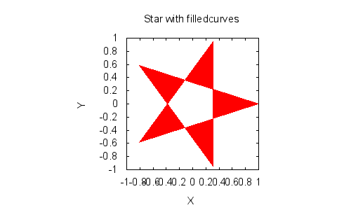
There are several variants You can use filledcurves to draw a filled shape. If you feed in two columns of data, that is the default style:
    $t = xvals(6) * 3.14159 * 4 / 5;
    $x = cos($t); $y = sin($t);

    $w = gpwin(png, output=>"star.png", size=>[4,3.5,'in'], font=>",11");
    $w->plot( title=>"Star with filledcurves", justify=>1, xlab=>"X", ylab=>"Y",
             with=>filledcurves, $x, $y
      );
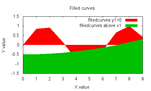
Other two-column variants include distance to an axis or line, and distance from a point:
    $w = gpwin(png, output=>"filled.png", size=>[5,3,'in'], font=>",11");

    $w->plot({title=>"Filled curves", xlab=>"X value", ylab=>"Y value",yrange=>[-1.5,1.5]},
           with=>"filledcurves y1=0",legend=>"filledcurves y1=0",xvals(10), sin(xvals(10)),
           with=>"filledcurves above x1",legend=>"filledcurves above x1", xvals(10),xvals(10)/10**2 - 0.5
      );

    $w = gpwin(png, output=>"filled2.png", size=>[5,3,'in'],font=>",11");

    $w->plot({title=>"Filled to a point", xlab=>"X value", ylab=>"Y value", yrange=>[0,8]},
           with=>"filledcurves xy=5,6", legend=>"filledcurves xy=5,6", xvals(31)/3, 1 - sin(xvals(31)/3)
       );

You can also fill the distance between two different curves, by feeding a third column into the tuple:
    $x = xvals(10);
    $yhi = sin($x) + 4 + $x/10;
    $ylo = ($x**2)/50;

    $w = gpwin(png, output=>"filled3.png", size=>[5,3,'in'], font=>",11");
    $w->plot({yrange=>[0,8],title=>"Filled between curves", xlab=>"X value", ylab=>"Y value"},
        with=>"filledcurves", legend=>"filledcurves (3-tuple)", $x, $ylo, $yhi );
Basic point plots are OK, but there's so much more...
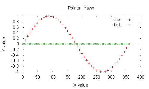
points: glyphs at (x,y) locations. Shouldn't you be using one of the errorbars styles?
    $w=gpwin(png, output=>"points.png", size=>[5,3,'in'],font=>',11');
    $w->plot(title=>"Points. Yawn.",xlab=>"X value", ylab=>"Y value",
         wi=>"points", le=>"sine",  xvals(46)*8,  sin(xvals(46)*3.14159*2/45),
         wi=>"points", le=>"flat",  xvals(46)*8, pdl(0)
     );
dots: tiny points at (x,y) locations - useful for scatterplots. On pixelated devices like PNG or the screen, scatterplots can get overwhelmed quickly (this one does!) -- but on a high resolution device like a PDF, they are far more useful.
    $a = rfits("/usr/local/src/PDL/m51.fits");
    $b = $a->convolveND(ones(9,9)/81);
    $w=gpwin(png, output=>"dots.png", size=>[4,4],font=>",11");
    $w->plot(title=>"Image smear",xlab="Original image value", ylab=>"Smoothed image value",
          with=>'dots', $a->flat, $b->flat);
circles: useful for filled circles, outlined circles, or both.
    $x = xvals(51);
    $y = sin($x/5);
    $r = cos($x/5) / 3;
    $color = ($x-25)->abs;
    $w = gpwin(png, output=>"circles.png", size=>[5,3,'in'],font=>',11');
    $w->plot(title=>"Circles", xlab=>"X",ylab=>"Y",style=>"fill solid",
           with=>"circles fillcolor palette", $x, $y, $r, $color);
ellipses: accepts x, y, major_diameter, minor_diameter, angle. If you omit the angle the major diameter is horizontal. If you omit the minor diameter, the ellipses are circles.
Notice that the major diameter as delivered doesn't have to be the actual major diameter of the ellipse -- the ellipses at the left hand side of the plot have a "major diameter" that is small than their "minor diameter".
    $x = xvals(51)/50;
    $y = $x**2;
    $rmaj = sin($x*3.14159*2);
    $rmin = cos($x*3.14159*2);
    $w = gpwin(png,output=>"ellipses.png", size=>[5,5,'in'],font=>',11');
    $w->plot(title=>"Ellipses", xlab=>"X value", ylab=>"Y value",j=>1,
       with=>"ellipses",$x,$y,$rmaj, $rmin);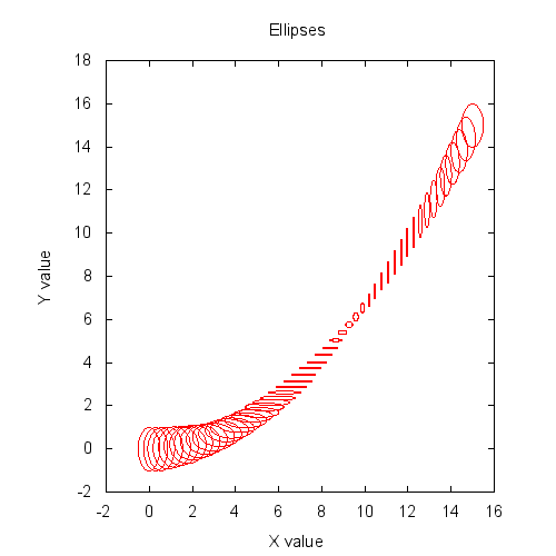
labels: Places text labels at (x,y) locations on your plot. You can also vary the size and color of the labels by feeding in additional columns.
The example text here shows both how to place generic labels around the field, and also how to modify their size. It's a little awkward - you have to use the enhanced text mode to do so. That requires using a "{/= foo}" string for each "foo" you want plotted. We generate it on the fly with Perl's
map {} @listconstruct.
    $t = xvals(8)*2*PI/7;
    $x = 10*sin($t); $x(7).=0;
    $y = 10*cos($t); $y(7).=0;
    $size = 12 + (xvals(8)==7)+9;
    $labels = ["Happy","Dopey","Sneezy","Lazy","Grumpy","Sleepy","Doc","Snow White"];
    $w=gpwin(png,out=>"labels.png",size=>[8,4,'in'],font=>',11', enhanced=>1);
    $w->multiplot(layout=>[2,1]);
    $w->plot(title=>"Labels with one font",xr=>[-12,12],yr=>[-12,12],
                    with=>"labels",$x,$y,$labels);
    $w->plot(title=>"Labels with variable size",xr=>[-12,12],yr=>[-12,12],
                    with=>"labels", $x, $y, [ map { "{/=".(12+9*m/White/)."$_}" } @$labels]);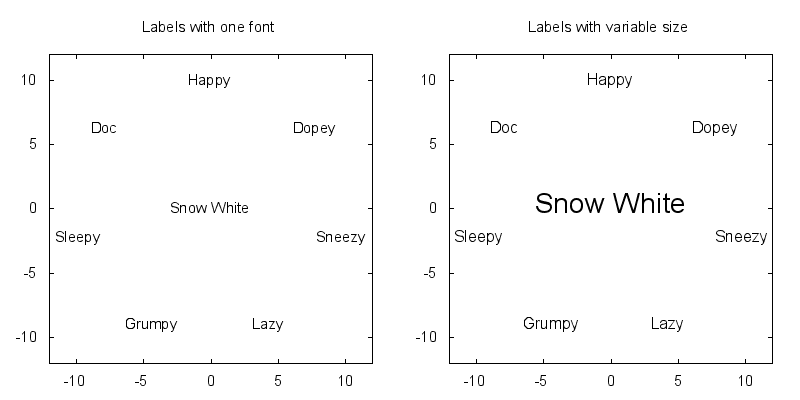
vectors:You can plot vector fields using little arrows. See the gnuplot documentation for how to modify the arrows' style -- you can.
    $xy = ndcoords(11,11)->clump(1,2) - 5;
    $theta = 80*PI/180;
    $rotmat = pdl( [ cos($theta), sin($theta) ], [-sin($theta), cos($theta)]);
    $vec = $xy x $rotmat;
    $w=gpwin(png,output=>"vectors.png",size=>[4,4],font=>",11");
    $w->plot( {title=>"A simple vector field plot",j=>1}, with=>'vectors', $xy((0)), $xy((1)), $vec((0))/10, $vec((1))/10 );
Error bar plots are the bread-and-butter of correct scientific plotting, and there are many to choose from. Most of the styles can accept either a single error size (and create a symmetric error bar of that size, relative to each plotted point) or a pair of bounds (and create a not-necessarily-symmetric error bar between those absolute bounds for each plotted point).
yerrorbars, xerrorbars, xyerrorbars: these are the basic bread-and-butter point plots, with I-beam error bars in the vertical and/or horizontal directions.
    $x = xvals(31);
    $y = $x**2 / 30;
    $dy1 = 10*cos($x/2);
    $dy2 = 10*sin($x/2);
    $w=gpwin(png,output=>'errorbars.png',size=>[9,3],font=>',10',enh=>1);
    $w->multiplot(layout=>[3,1]);
    $w->options(yr=>[-30,30],xr=>[-15,35]);
    $w->plot( {title=>"{/=12 yerrorbars: absolute and relative}"},
                     legend=>"Relative Y errorbars", with=>'yerrorbars', $x, $y, $dy1,
                     legend=>"Absolute Y errorbars", with=>'yerrorbars', $x, $y/2-15, ($y-$dy1**2/3)/2-15, ($y+$dy2**2/3)/2-15
                   );
    $w->plot({title=>"{/=12 xerrorbars: absolute and relative}",key=>'bottom center'},
                    legend=>"Relative X errorbars", with=>'xerrorbars', $x, $y, $dy1,
                    legend=>"Absolute X errorbars", with=>'xerrorbars', $x, $y/2-15, ($x-$dy1**2/10), ($x+$dy2**2/10)
                   );
    $w->plot({title=>"{/=12 xyerrorbars: absolute and relative}",key=>'top left'},
                    legend=>"Relative XY errorbars", with=>'xyerrorbars', $x, $y, $dy1, $dy1,
                    legend=>"Absolute XY errorbars", with=>'xyerrorbars',
                      $x, $y/2-15, ($x-$dy1**2/10), ($x+$dy2**2/10), ($y-$dy1**2/3)/2-15, ($y+$dy2**2/3)/2-15
                   );
    $w->end_multi;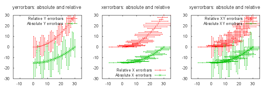
yerrorlines, xerrorlines, xyerrorlines: These work just like the errorbars plots above, but connect the actual data points with line segments.
boxerrorbars and boxxyerrorbars: boxes (see the histogram plots), only ... with errorbars added.
candlesticks and financebars: Candlestick style and stem-and-leaf style dual-error-bar plots. They're used for financial reporting, and also for describing slightly more about your error distribution than just mean and standard deviation.
    $x = xvals(18)+ asin((xvals(18)-3)%7 <math>x^y</math> for <math>-10</math> and <math>y \in [0,1,2,3,4]</math>.
    $x = sequence(101)->xlinvals(-10,10);
    $y = sequence(1,5);
    $z = $x**$y;
    $z/=$z->maximum->transpose; #normalize z curves so we can see the differences
    $yp = $y->(*$x->dim(0))->clump(2);
    $view = [60,30,1,1];
    $leg = [map{sprintf("x^%d",$_)}(0..4)];
    $w=gpwin('png',(output=>'3dlines.png',size=>[8,5,'in'],enhanced=>1));
    $w->plot({title=>"3D line plot (x^y)",view=>$view,trid=>1,xlabel=>"X", ylabel=>"y (power)",zlabel=>"x^y"},{legend=>$leg,with=>'lines linewidth 3'},$x,$yp,$z);
You can plot surfaces as a wireframe by feeding 2-D data into the "lines" command.
    $rv = rvals(51,51)/25 * 3.14159 * 4;
    $z = cos($rv) / (0.25 + $rv/3.15159);
    $w = gpwin('png',output=>'3dgrid.png',size=>[8,5,'in'],enhanced=>1);
    $w->plot3d({title=>"'with lines' in 3D mode gives a grid"}, with=>'lines', $z);
To plot a real surface, use "with pm3d" . In its simplest form you just feed in a single 2-D PDL and it will be automagically shaded using the default color map (you can use 'clut' to change the color map, or feed in color table parameters manually, just as with an image).
    use PDL::Constants;
    $rv = rvals(51,51)/25 * PI * 4;
    $z = cos($rv) / (0.25 + $rv / PI);
    $w=gpwin('png',output=>'pm3d-simple.png',size=>[8,5,'in'], enhanced=>1);
    $w->plot3d({title=>"'with pm3d' with one 2-D PDL gives autoshading'"},with=>'pm3d',$z);
You can distort the image by feeding in an XY coordinate for every point.
    use PDL::Constants;
    $rv = rvals(51,51)/25 * PI * 4;
    $z = cos($rv) / (0.25 + $rv/PI);
    $x = sqrt(xvals($rv));
    $y = yvals($rv) ** 2;
    $w=gpwin('png', output=>'pm3d-distorted.png',size=>[8,5,'in'],enhanced=>1);
    $w->plot3d({title=>"'with pm3d' with sqrt scaling in x and y^{2} scaling in y"},with=>'pm3d',$x,$y,$z);
Here's an example involving plotting a vector field on top of an image.
    ## Data setup
    $tails = ndcoords(10,10)->mv(0,-1);        # a grid
    $rel_heads = pdl(sin(sequence(10,10)/10*PI),
                     cos(sequence(10,10)/10*PI)
                    ) / 3;
    ## Three panel plot
    $w=gpwin( pngcairo, output=>’axes.png’,size=>[12,4], font=>',10' );
    $w->multiplot(layout=>[3,1]);

    $w->options(justify=>1, xlab=>”X”, ylab=>”Y”);
    $w->plot(with=>’image’, sequence(10,10),
             with=>’vectors’, $tails->dog, $rel_heads->dog,                 # 1D columns; thread over dim 1
             {title=>”Image + 10 threaded vector fields”});

    $w->plot(with=>’image’, sequence(10,10),
             with=>’vectors’, cdim=>2, $tails->dog, $rel_heads->dog, # 2D column: do not thread over dim 1
             {title=>”Image + single vector field”});

    $w->plot(with=>’image’, sequence(10,10),
             with=>’vectors’, cdim=>2, $tails->dog, $rel_heads->dog,
             {title=>”video-indexing style image”, yrange=>[9.5,-0.1]}); # reverse direction of yrange

    $w->end_multi;
Here's an example two-panel rendering of the geometry of several spacecraft in on 16-Dec-2008. It shows two "overhead" views of the ecliptic plane, with relevant objects rendered as circles.
This is a little more complicated than it has to be, to demonstrate a couple of types of iteration over glyph lists, and drawing arbitrary shapes using "with lines". The circular graticule, for example, could equally well be rendered in radial coordinate mode.
This code uses inline modifiers to the "with" specifier, which (as of PDL::Graphics::Gnuplot 1.3) still require interpolating Gnuplot command fragments into a string. That behavior should remain backward-compatible but will be replaced with hash ref parameter passing.
    use PDL::NiceSlice; use PDL::Constants;

    ## Data entry
    $au = 1.496e8;   #km per AU
    $ace_heq    = pdl(1.0, 0) - pdl(1.408e6,-1.70e5) / $au;   # from ACE metadata
    $wind_heq   = pdl(1.0, 0) - pdl(1.6e6,    -1.5e5)   / $au;# from WIND metadata
    $s_a_heq    = pdl(1.069e11, 0.965e11) / 1e3 / $au;        # from STEREO-A metadata
    $s_b_heq    = pdl(1.112e11,-1.078e11) / 1e3 / $au;        # from STEREO-B metadata
    $earth_heq  = pdl(1.005, 0);  # Earth isn't always at 1.000 AU (surprise!)


    $oc = " offset character "; # Abbreviation used in table below
    $r = pdl(0.002); # Glyph radius in AU
    $s = sub { return sprintf("lc rgb \"%s\"",$_[0]);};  # CODE ref sets the "line" color for each glyph

    # The list gets (name, coords, color, label-position).  Note the #rrggbb format for Earth's color.
    @list = ( [ "Earth",   [$earth_heq->dog, $r*10 ], &$s("#40e0e0"), "center $oc 0,1" ],
              [ "Wind",    [$wind_heq->dog,  $r* 6 ], &$s("black"),   "right $oc -1,0" ],
              [ "ACE",     [$ace_heq->dog,   $r* 6 ], &$s("magenta"), "center $oc 0,-1"],
              [ "STEREO-A",[$s_a_heq->dog,   $r*10 ], &$s("blue"), "center $oc 0,-0.75"],
              [ "STEREO-B",[$s_b_heq->dog,   $r*10 ], &$s("red"),  "center $oc 0, 0.5" ],
              [ "Sun",     [pdl(0),pdl(0),pdl(0.05)], &$s("yellow"), "left $oc 1.5, 1" ] );

    ## Example of splicing together several circles into a single plottable line
    ## The circles are found in the usual way, and are spliced together with NaN
    ## in between them, to break the plotted line. This makes a set of coordinates
    ## that draw a circular graticule using "with lines", given the radii of the circles.
    $circth = xvals(360+1) * PI / 180;
    $circx = sin($circth);
    $circy = cos($circth);
    $cir = sub {
      my @radii = dog shift;     my $nan = asin(pdl(1.1));
      my @circxs = map { ( $circx * $_, $nan ) } @radii;
      my @circys = map { ( $circy * $_, $nan ) } @radii;
      return ( $nan->glue(0, @circxs), $nan->glue(0, @circys) );
    };

    # Basic window construction, with a 2x1 multiplot
    $w = gpwin( png, output=>"solar_system.png",size=>[6,4.5,'in'],enh=>1, font=>',12');
    $w->multiplot(layout=>[2,1]);

    # We make two plots with slightly different parameters, so why not
    # parameterize with a subroutine?
    $p = sub {
      my( $xr, $yr, $title, $a, $radii, $scale ) = @_;

       #Figure projection values for the graticule labels
       $xm = cos($a); $ym = sin($a);

      $w->plot(
           {
               xr=>$xr, yr=>$yr, title=>$title,
               j=>1, xtics=>0, ytics=>0,
           },

           ######## Concentric circles and their labels
           with=>'lines ls 2 lw 2',
           &$cir($radii),
           with=>'labels left offset 0.5, 0',
           $radii * $xm, $radii * $ym,
           [ map { sprintf( "{/=9 %g}\\n{/=9 AU}", $_, ) } $radii->list ],

           ######## A single glyph and label for each object
           map {
             ( with=>"circles fs solid $_->[2]",
               $_->[1]->[0], $_->[1]->[1], $scale * $_->[1]->[2],
               with=>"labels $_->[3]",
               $_->[1]->[0], $_->[1]->[1], [$_->[0]]
             )
            } @list
      );
    };

    ### Pedal hits the metal - generate two plots.
    &$p( [-0.01, 1.1], [-0.8, 0.8], "2008-Dec-16 Ecliptic Plane",
         -25*PI/180, (xvals(5)+1)/5, 1);
    &$p( [0.983, 1.009], [-0.019, 0.019], "2008-Dec-16 Near Earth",
         -0.5*PI/180, pdl(985,990,995,1000,1005)/1000, 0.05);

    ### Close out window - necessary for some devices.  Also ends multiplot.
    $w->close;