This project provides support for handling smaller screen sizes with Bootstrap 3 (CSS version only).
The new breakpoints are
- bootstrap-xxs.css:
xxsat 480px - bootstrap-xxs-tn.css:
xxsat 480px andtnat 384px
New classes are:
col-xxs-[1-12]with corresponding-pull-,-push-and-offset-hidden-xxsvisible-xxs,visible-xxs-block,visible-xxs-inline,visible-xxs-inline-block- Same for
-tn-(only included inxxs-tnversion)
- Download the tarball or install with package managers (recommanded)
bower install bootstrap-xxs- or
npm install bootstrap-xxs
-
Include bootstrap-xxs-tn.css or bootstrap-xxs.css in your project. This will handle all functions, but visible-xs* and hidden-xs classes.
-
For full support you need to patch your
bootstrap.csswith one of these methods OR use bootstrap-patched.css or bootstrap-patched.min.css
- Method 1: Use Regex to search and replace in bootstrap.css/bootstrap.min.css
search for@media \(max-width: ?767px\)( ?\{\n? *.(visible|hidden))
replace with@media (min-width: 480px) and (max-width: 767px)$1
Should be 5 matches. - Method 2: Apply bootstrap.css.patch (unminified only)
Same usage as for xs, sm, md or lg.
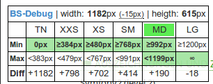
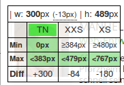
There is a small (and ugly) script, which shows the recognised device size, browser width and calculates the difference to the next breakpoints. It requires jQuery (tested only with v1.11.1). Include bsdebug.min.js in your project (after jQuery), reload.
Now resize your browser and watch the overlay.


Alternative: Use this bookmarklet. Create a new bookmark with target:
javascript:(function%20(){var%20n=document.createElement('script');n.setAttribute('language','JavaScript');n.setAttribute('src','http://manueltransfeld.de/js/bsdebug_bookmarklet.min.js');document.body.appendChild(n);})();Visit www.manueltransfeld.de and double click on my photo to toggle BS-Debug.