-
-
Notifications
You must be signed in to change notification settings - Fork 148
New issue
Have a question about this project? Sign up for a free GitHub account to open an issue and contact its maintainers and the community.
By clicking “Sign up for GitHub”, you agree to our terms of service and privacy statement. We’ll occasionally send you account related emails.
Already on GitHub? Sign in to your account
feat(japanesewithanime.com): init #851
base: main
Are you sure you want to change the base?
Conversation
|
Having taken a look I agree that the website does look wierd when you have the catppuccin colors with those borders, but this is still an opinionated change and i'm unsure wether it should be allowed. |
|
@isabelroses i've added a commit with the option to change some of the formatting changes.
some things like the search bar button needed a lot of formatting changes to look like the original and i'm not sure why |
|
Can you update this branch with main and resolve the conflicts? |
…and Original search bar
90d8077
to
0484b87
Compare
|
@uncenter it's updated now |
There was a problem hiding this comment.
Choose a reason for hiding this comment
The reason will be displayed to describe this comment to others. Learn more.
Also please remove commented out styles and format the document.
| @var select lightFlavor "Light Flavor" ["latte:Latte*", "frappe:Frappé", "macchiato:Macchiato", "mocha:Mocha"] | ||
| @var select darkFlavor "Dark Flavor" ["latte:Latte", "frappe:Frappé", "macchiato:Macchiato", "mocha:Mocha*"] | ||
| @var select accentColor "Accent" ["rosewater:Rosewater", "flamingo:Flamingo", "pink:Pink", "mauve:Mauve", "red:Red*", "maroon:Maroon", "peach:Peach", "yellow:Yellow", "green:Green", "teal:Teal", "blue:Blue", "sapphire:Sapphire", "sky:Sky", "lavender:Lavender", "subtext0:Gray"] | ||
| @var select linkColor "Link color" ["rosewater:Rosewater", "flamingo:Flamingo", "pink:Pink", "mauve:Mauve", "red:Red", "maroon:Maroon", "peach:Peach", "yellow:Yellow", "green:Green", "teal:Teal", "blue:Blue*", "sapphire:Sapphire", "sky:Sky", "lavender:Lavender", "subtext0:Gray"] |
There was a problem hiding this comment.
Choose a reason for hiding this comment
The reason will be displayed to describe this comment to others. Learn more.
We should use either accent color or blue and lavender as per the style guide.
There was a problem hiding this comment.
Choose a reason for hiding this comment
The reason will be displayed to describe this comment to others. Learn more.
@uncenter i don't see why the color of links couldn't be an option since it defaults to blue.
the reason i added it as in option is that the titles are links, and the writing has a lot of links.
is there a specific reason why the user shouldn't be able to change link color?
also where in the style guide does it say accent color can be used as link color?
There was a problem hiding this comment.
Choose a reason for hiding this comment
The reason will be displayed to describe this comment to others. Learn more.
It doesn't it's more something we do in userstyles. Not sure how it started but that's usually how we do things. (It's probably a mix of some websites using the "primary color" CSS variable for links, people not reading the style guide from before this repository started, websites having few places to use the accent color, etc.) We've had some discussion recently but currently no changes are planned. cc @isabelroses thoughts?
There was a problem hiding this comment.
Choose a reason for hiding this comment
The reason will be displayed to describe this comment to others. Learn more.
I'd like accent colour for links to be the exception instead of the norm. I believe @isabelroses's reasoning is that accent links made a bit more sense to implement for something like a search engine port.
I'd prefer if we kept links to blue aside from exceptions like the above 🤔
There was a problem hiding this comment.
Choose a reason for hiding this comment
The reason will be displayed to describe this comment to others. Learn more.
I'd estimate the majority of userstyles at the moment use accent for links. If this is something you want to stick by it might be worth creating a tracking issue for locating and updating this in all applicable userstyles.
On this PR specifically, let's use the blue links / style guide spec here and remove the link color option.
There was a problem hiding this comment.
Choose a reason for hiding this comment
The reason will be displayed to describe this comment to others. Learn more.
I'm happy to have my mind changed by yourself and @isabelroses if you guys feel particularly strong about it, can discuss further on discord and summarise in a tracking issue if it comes to that.


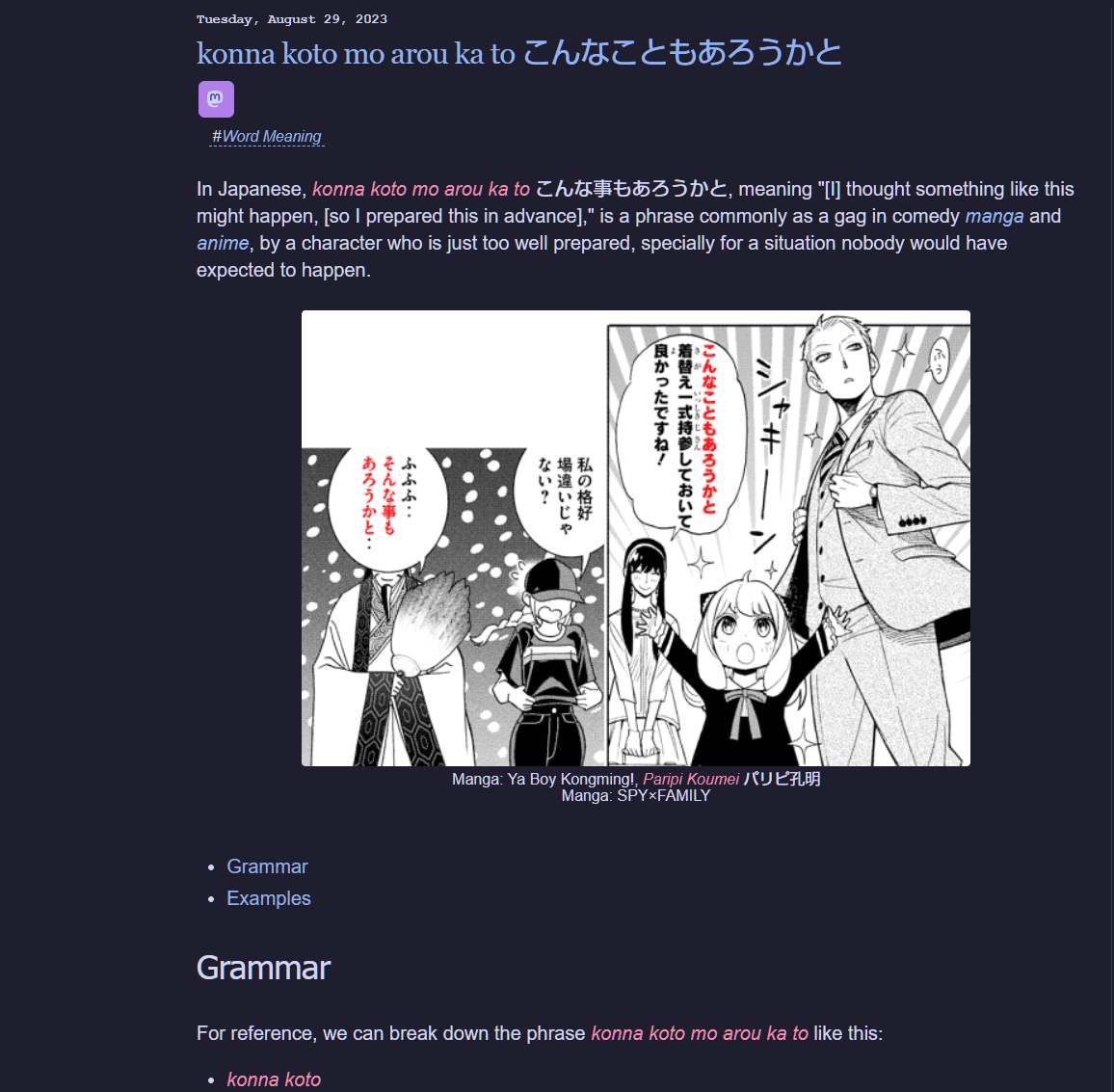
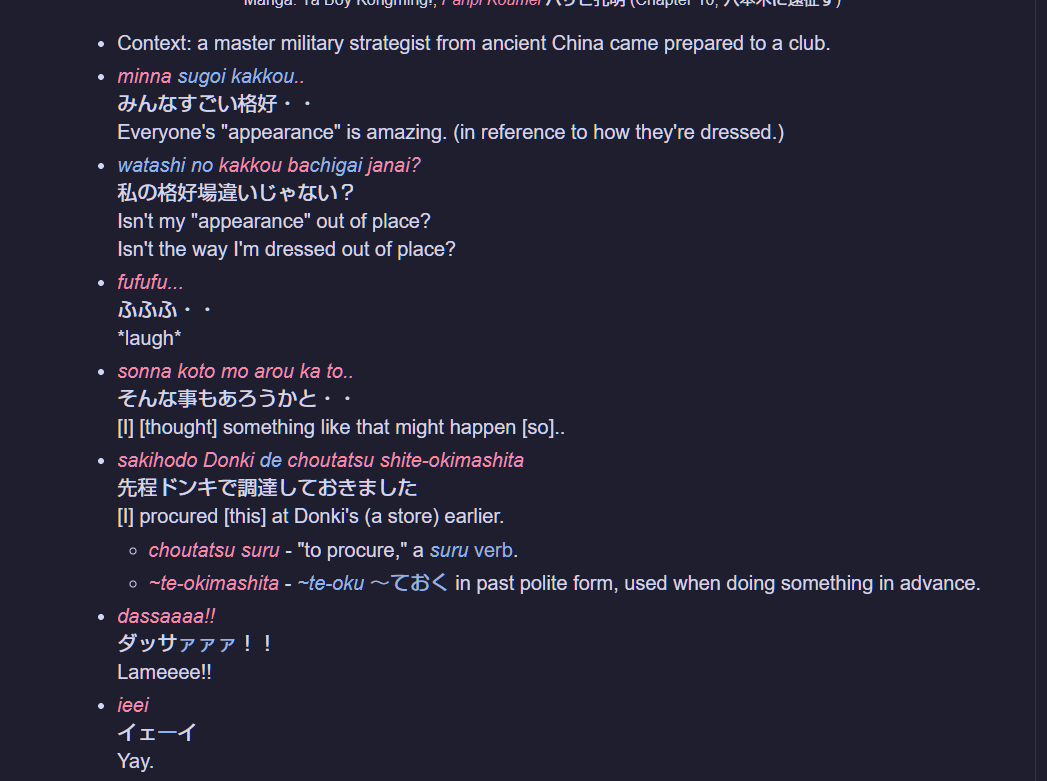
🎉 Theme for japanesewithanime.com 🎉
💬 Additional Comments 💬
sections like 'Poses & Gestures' at the bottom of japanesewithanime.com/2021/03/seiza.html are not themed when hoving over itemsfixed it
🗒 Checklist 🗒
/styles/<name-of-website>containing the contents of the/templatedirectory.userstyles.ymlfile with information about the new userstyle.
catppuccin.user.css- all the CSS for the userstyle, based on thetemplate.
preview.webp- composite image of all four individual flavor screenshots stitched together,generated via Catwalk.