
.png)
npm install ff-validation --save
app.module.ts
import {NgModule} from '@angular/core';

import {AppComponent} from './app.component';
import {FFValidationModule} from 'ff-validation';

@NgModule({
  declarations: [
    AppComponent
  ],
  imports: [
    FFValidationModule
  ],
  bootstrap: [AppComponent]
})
export class AppModule {
}properties [ff-validation-errors] and [ff-validation-messages] are required
app.component.html
<ff-validation
[ff-validation-errors]="myErrorsArr"
[ff-validation-messages]="myMessages">
  <!-- Send your input as content in ff-validation component to be able to add all attributes
  which you need (e.g aria or angular reactive forms attributes)-->
  <!-- !IMPORTANT. Remember you need marked your input with "FFValidationInput" directive -->
  <input type="text" FFValidationInput aria-label="Name">
</ff-validation>
app.component.ts
import {Component} from '@angular/core';
@Component({
selector: 'ff-root',
templateUrl: './app.component.html',
styleUrls: ['./app.component.scss']
})
export class AppComponent {
...
myErrorsArr = [];
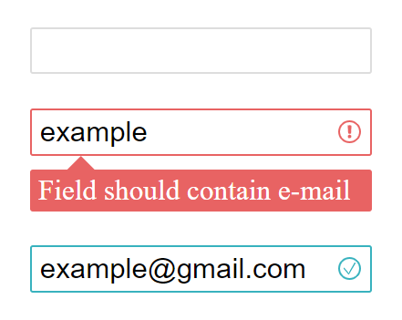
myMessages = {
'email': 'Field should contain e-mail',
'required': 'Field is required!',
'phone': 'Field should contain phone',
'pattern': 'Field does not match to pattern'
};
validate(){
// Implement here your method to validate input or use angular Validator with ReactiveForms
if(this.inputValue === ''){
// and just send errors array to ff-validation component
this.myErrorsArr.push('required')
}
}
...
}app.component.html
<form [formGroup]="myForm">
  <ff-validation [ff-validation-errors]="myErrors"
                 [ff-validation-messages]="{'required': 'Field is required!',
                                            'pattern': 'Field should contain e-mail'}"
                 [ff-icon-invalid]="myInvalidIcon"
                 [ff-icon-valid]="myValidIcon">
<!-- Also you can put your icon as ng content (e.g. envelope for email input) as on screen below -->
    <i class="icon"></i>
    <input type="text" placeholder="Email" FFValidationInput [formControlName]="'userEmail'" #email="FFValidationInput">
  </ff-validation>
</form>

<!-- You can change default input icons to your
Just create a ng-template with your content and define Template Reference Variables (#var)
then put it in ff-validation component [ff-icon-invalid] or [ff-icon-valid] -->
<ng-template #myInvalidIcon>
  <!--  Here can be whatever you want, text, icon,
  some component, button to clear invalid input and so on...-->
  <span>X</span>
</ng-template>

<ng-template #myValidIcon>
  <i class="fa fa-check"></i>
</ng-template>.png)
###ff-validation component api
[ff-validation-errors] is strings array which contains names of your validation errors.
['required', 'email'][ff-validation-messages] is object where key is validation error name and value is message.
{required: "Field is required!",
 email: "Field should contain valid e-mail"}
[ff-icon-invalid] and [ff-icon-valid] properties take a template reference variable and replace default icons with yours
###FFValidationInput directive api
Selector: FFValidationInput
Exported as: FFValidationInput
You need marked your input with "FFValidationInput" directive. If you need - you can create local variable and that provides access to directive instance.
<input type="text" FFValidationInput #email="FFValidationInput">The directive has properties:
  value:string; // input value
  dirty:boolean; // true if input`s default value was changed
  touched:boolean; // true if input was touched
focused:boolean; // true if input is focusedYou can change default styles.
.ff-validation-input{
/* for input */
}
.ff-validation-errors{
/* for messages wrapper */
}
.ff-invalid{
/* this class will be added to .ff-validation-input when input is dirty,
touched and errors array is not empty*/
}
.ff-valid{
/* this class will be added to .ff-validation-input when input is dirty,
touched and errors array is empty*/
}MIT © Frontend Freelancer