Codecov explained
We are using Codecov to produce code coverage reports. This service is quite useful, but unfortunately their documentation sucks. In order to help people interpret its output, I made some graphics with explanations. This all is based on pull request #1075.
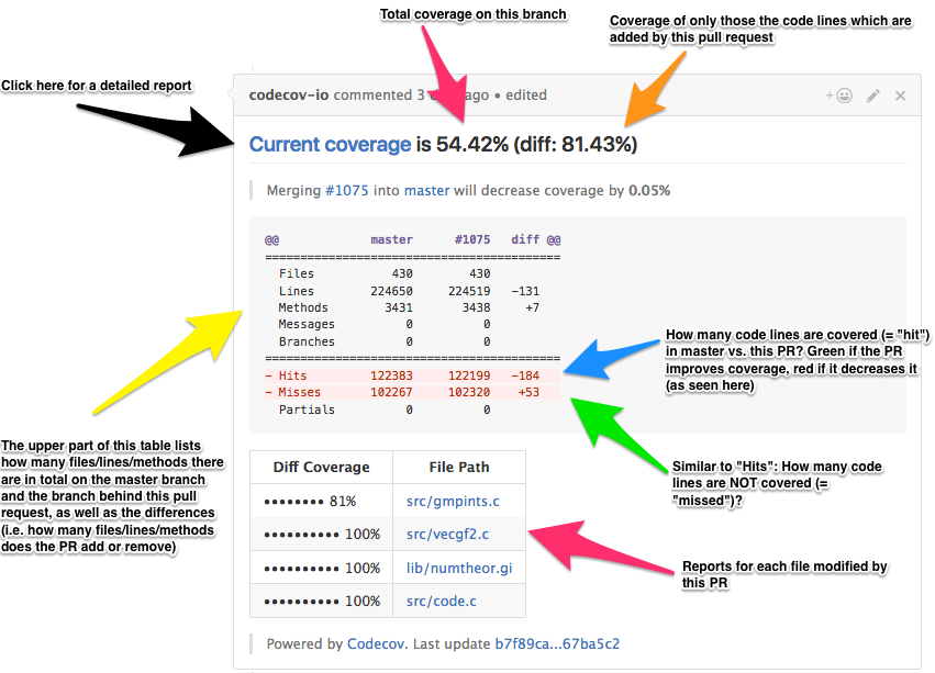
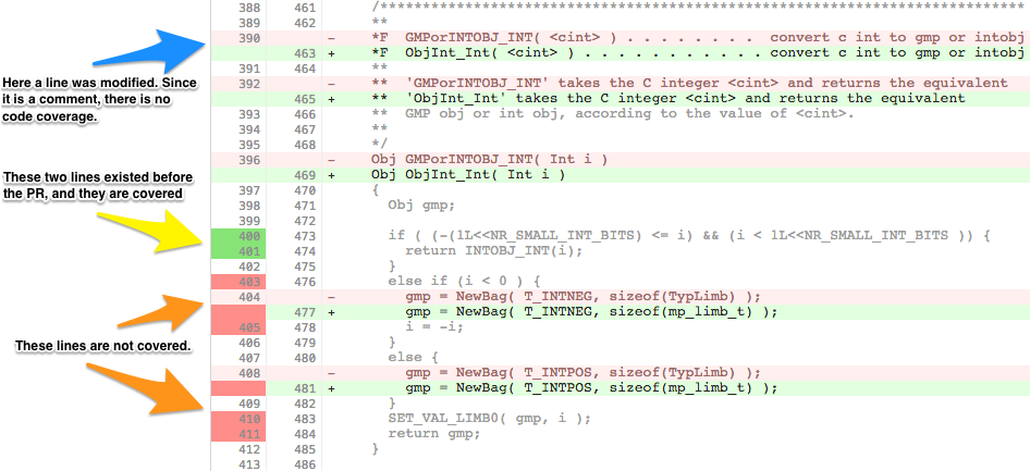
If you follow the Current coverage link, then you can get more detailed information about the coverage changes in the pull request. For me, the most interesting page typically is the one behind the Compare link. There, you are shown a diff with all the changes. New (i.e. added or changed) lines are shown in green, old (i.e. removed or replaced) lines in red. In addition, the leftmost line number column can be coloured with a darker shade of red or green. This indicates whether the line is covered (dark green) or not (dark red) by tests.