BottomBar ported to C#
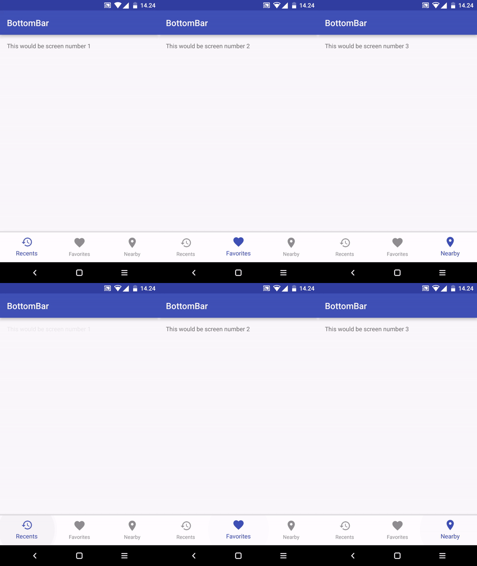
A custom view component that mimics the new Material Design Bottom Navigation pattern.
Yes! It's currently available like BottomNavigationBar package.
Yes! Thanks Thrive GmbH for BottomNavigationBarXF implementation.
The current minSDK version is API level 11 (Honeycomb).
You can add items by specifying an array of items or by xml menu resources.
res/menu/bottombar_menu.xml:
<menu xmlns:android="http://schemas.android.com/apk/res/android">
    <item
        android:id="@+id/bottomBarItemOne"
        android:icon="@drawable/ic_recents"
        android:title="Recents" />
        ...
</menu>
MainActivity.cs
public class MainActivity : AppCompatActivity, BottomNavigationBar.Listeners.IOnMenuTabSelectedListener
{
    private BottomBar _bottomBar;

    protected override void OnCreate(Bundle bundle)
    {
        base.OnCreate(bundle);

        SetContentView(Resource.Layout.MainActivity);

        _bottomBar = BottomBar.Attach(this, bundle);
        _bottomBar.SetItems(Resource.Menu.bottombar_menu);
        _bottomBar.SetOnMenuTabClickListener (this);

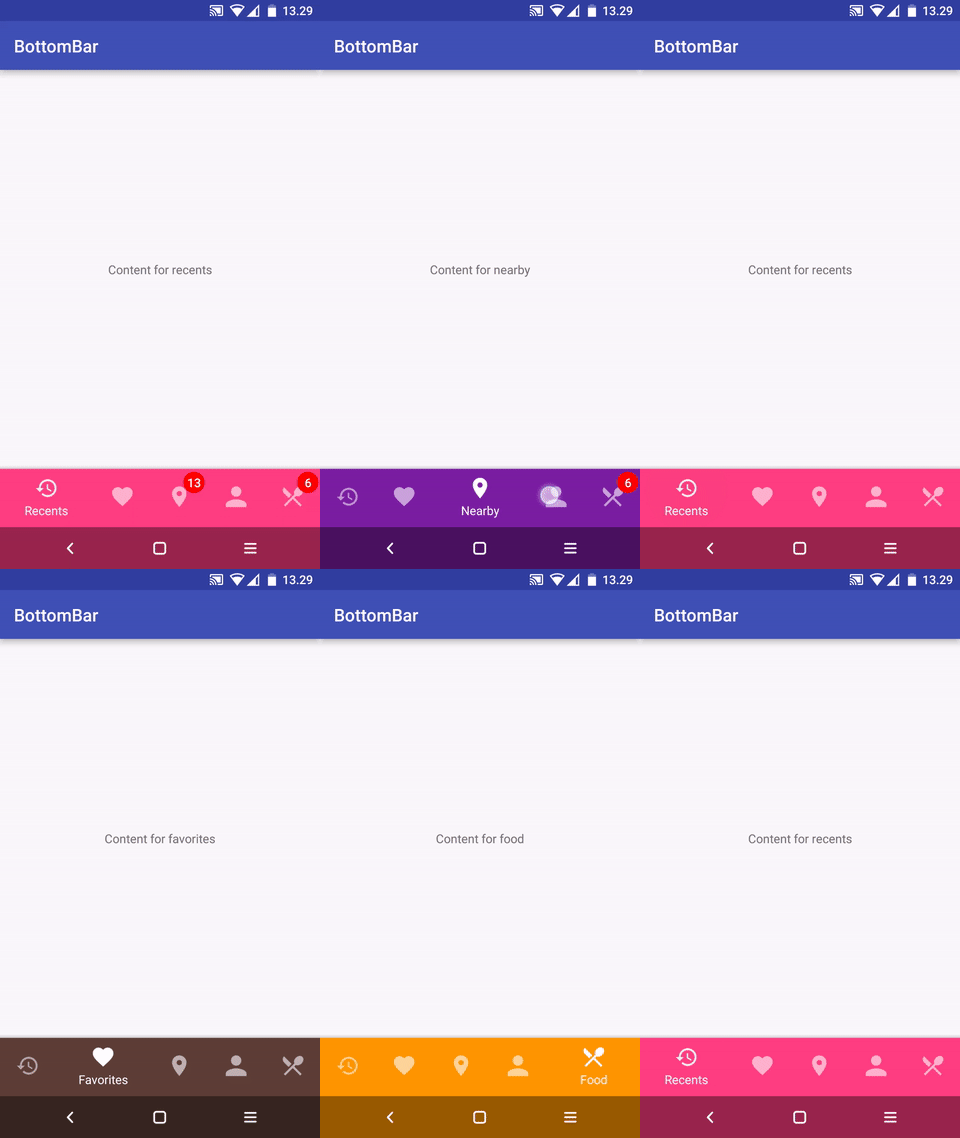
        // Setting colors for different tabs when there's more than three of them.
        // You can set colors for tabs in three different ways as shown below.
        _bottomBar.MapColorForTab(0, ContextCompat.GetColor(this, Resource.Color.colorAccent));
        _bottomBar.MapColorForTab(1, 0xFF5D4037);
        _bottomBar.MapColorForTab(2, "#7B1FA2");
        _bottomBar.MapColorForTab(3, "#FF5252");
        _bottomBar.MapColorForTab(4, "#FF9800");
    }

    public void OnMenuItemSelected(int menuItemId)
    {

    }

    protected override void OnSaveInstanceState(Bundle outState)
    {
        base.OnSaveInstanceState(outState);

        // Necessary to restore the BottomBar's state, otherwise we would
        // lose the current tab on orientation change.
        _bottomBar.OnSaveInstanceState(outState);
    }
}You can easily add badges for showing an unread message count or new items / whatever you like.
// Make a Badge for the first tab, with red background color and a value of "13".
BottomBarBadge unreadMessages = _bottomBar.MakeBadgeForTabAt(0, "#FF0000", 13);

// Control the badge's visibility
unreadMessages.Show();
unreadMessages.Hide();

// Change the displayed count for this badge.
unreadMessages.Count = 4;

// Change the show / hide animation duration.
unreadMessages.AnimationDuration = 200;

// If you want the badge be shown always after unselecting the tab that contains it.
unreadMessages.AutoShowAfterUnSelection = true;// Disable the left bar on tablets and behave exactly the same on mobile and tablets instead.
_bottomBar.NoTabletGoodness();
// Show all titles even when there's more than three tabs.
mBottomBar.UseFixedMode();
// Use the dark theme
_bottomBar.UseDarkTheme();
// Set the color for the active tab. Ignored on mobile when there are more than three tabs.
_bottomBar.SetActiveTabColor("#009688");
// Use custom text appearance in tab titles.
_bottomBar.SetTextAppearance(Resource.Style.MyTextAppearance);
// Use custom typeface that's located at the "/src/main/assets" directory. If using with
// custom text appearance, set the text appearance first.
_bottomBar.SetTypeFace("MyFont.ttf");MainActivity.cs:
// Instead of attach(), use attachShy:
_bottomBar = BottomBar.AttachShy((CoordinatorLayout) FindViewById(Resource.Id.myCoordinator),
    FindViewById(Resource.Id.myScrollingContent), savedInstanceState);
activity_main.xml:
<android.support.design.widget.CoordinatorLayout xmlns:android="http://schemas.android.com/apk/res/android"
    android:id="@+id/myCoordinator"
    android:layout_width="match_parent"
    android:layout_height="match_parent"
    android:fitsSystemWindows="true">

    <android.support.v4.widget.NestedScrollView
        android:id="@+id/myScrollingContent"
        android:layout_width="match_parent"
        android:layout_height="match_parent">

        <!-- Your loooong scrolling content here -->

    </android.support.v4.widget.NestedScrollView>

</android.support.design.widget.CoordinatorLayout>That's alright, you can also do it the hard way if you like living on the edge.
// If you use normal Fragments, just change the first argument to FragmentManager
_bottomBar.SetItems(
    new BottomBarTab(Resource.Drawable.ic_recents, "Recents"),
    new BottomBarTab(Resource.Drawable.ic_favorites, "Favorites"),
    new BottomBarTab(Resource.Drawable.ic_nearby, "Nearby")
);
For a working example, refer to the sample app.
No, but you can still put it anywhere in the View hierarchy. Just attach it to any View you want like this:
_bottomBar.Attach(FindViewById(Resource.Id.myContent), savedInstanceState);Probably because you're doing some next-level advanced Android stuff (such as using CoordinatorLayout and fitsSystemWindows="true") and the normal paddings for the content are too much. Add this right after calling Attach():
_bottomBar.NoTopOffset();You can disable it.
_bottomBar.NoNavBarGoodness();All you need to do is instead of attaching the BottomBar to your Activity, attach it to the view that has your content. For example, if your fragments are in a ViewGroup that has the id fragmentContainer, you would do something like this:
_bottomBar.Attach(FindViewById(Resource.Id.fragmentContainer), savedInstanceState);By default, BottomBar only starts to use the specified MapColorForTab value for the BottomBar background if you have more than three tabs. If you want to enable this functionality for tab bars with three items or less, do the following before you add any items to the BottomBar:
_bottomBar.MaxFixedTabCount = n-1;(where n is the number of tabs: so, if you have a BottomBar with 3 items, you would call MaxFixedTabCount = 2;)
It works nicely with tablets straight out of the box. When the library detects that the user has a tablet, the BottomBar will become a "LeftBar", just like in the Material Design Guidelines.
- LetMeGet : BottomNavigationBar is used in the LetMeGet app.
Send me a pull request with modified README.md to get a shoutout!
Feel free to create issues.
BottomBar library for Android ported to C#
Copyright (c) 2016 Iiro Krankka (http://github.com/roughike).

Licensed under the Apache License, Version 2.0 (the "License");
you may not use this file except in compliance with the License.
You may obtain a copy of the License at

http://www.apache.org/licenses/LICENSE-2.0

Unless required by applicable law or agreed to in writing, software
distributed under the License is distributed on an "AS IS" BASIS,
WITHOUT WARRANTIES OR CONDITIONS OF ANY KIND, either express or implied.
See the License for the specific language governing permissions and
limitations under the License.

